Visual Merchandising for Jewelry Stores: Placement, Light, and Color That Sell
Visual merchandising is the cheapest sales lever a jewelry store has, and the most consistently wasted. The same piece can sit unnoticed for weeks or sell in 20 minutes depending on nothing more than where it sits, how it is lit, and how much room it has to breathe. That is the part owners underrate: you are not choosing between a piece that sells and one that does not, you are often choosing between 2 outcomes for the exact same piece. Merchandising is not about making the store look pretty. It is about engineering where the customer’s eye lands and steering it toward the pieces you most want to sell. This guide covers the levers that actually move sales: attention, color, placement, light, and staging.
Understand How Customers Actually Look at Your Cases
Customers do not study a case the way the owner who arranged it does. The owner sees every piece; the customer’s eyes scan in quick patterns and settle on a few zones, no matter how lovely an individual item is. Eye level and the upper-center of a display pull the most attention, and the lower corners pull the least. There is an old retail adage that eye level is buy level, and in a jewelry case it is close to a law. The practical rule follows directly: your highest-margin pieces belong where attention naturally lands, not wherever they happen to coordinate with the case. The signature engagement ring earns the prime spot. The fashion earrings that merely match your color scheme do not, however nicely they tie the case together.
You also have only a moment to convert a glance into interest, not the prolonged examination most displays are unconsciously built for. A case has to grab attention first and reward close study second, never the other way around. If a customer has to work to find the hero piece, the case has already lost.
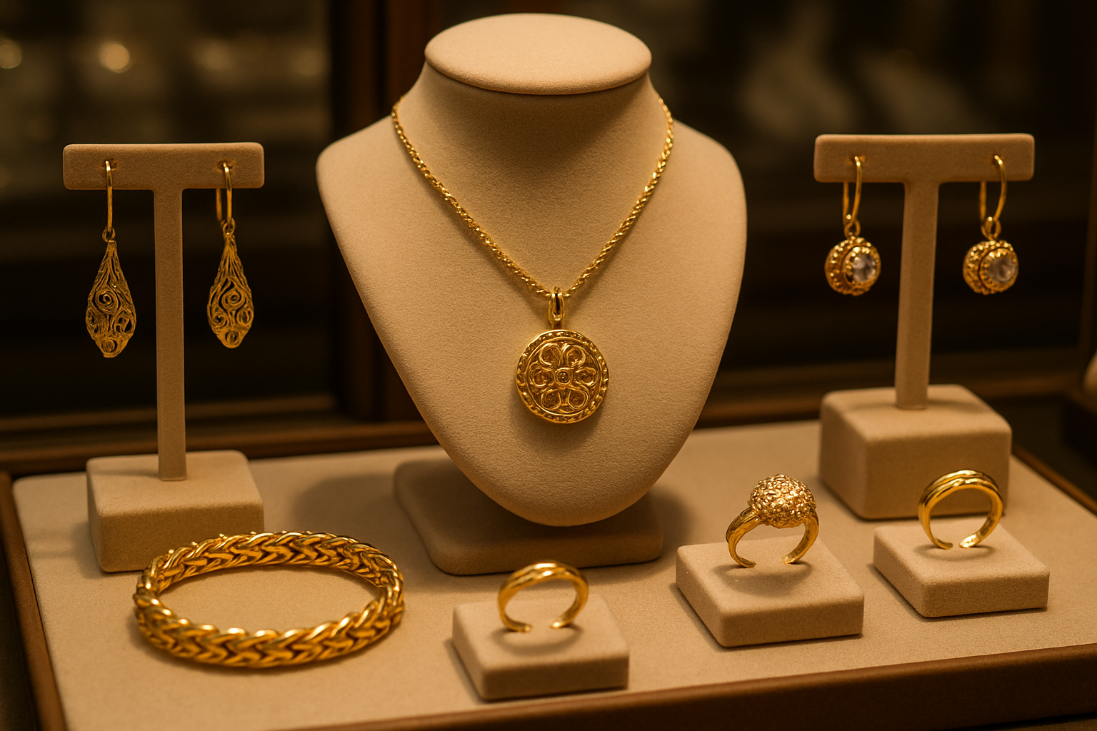
Use Background Color to Shape Perceived Value
Background color changes how rich and valuable a piece looks before the customer reads a single tag, which makes it free margin if you get it right and a quiet tax if you get it wrong. Match the background to the metal and stone rather than to your store’s brand palette:
| Background | Best for | Effect |
|---|---|---|
| Black velvet | Diamonds and white metals | Maximum contrast; stones read brighter and larger |
| Navy blue | Yellow gold and colored stones | Warmth and richness with a trustworthy, premium feel |
| Deep purple | Silver and platinum | An exclusive, elevated tone that supports premium pricing |
| Cream or ivory | Rose gold and pearls | Soft, emotional warmth that suits gifting pieces |
The common mistake is mixing several background colors in 1 case, which creates visual chaos and lets no single piece stand out. Use 1 background per case and let the jewelry itself supply the variety. The case should feel like a curated collection, not a sample box.
Position for Revenue, Not Symmetry
Not every inch of a case is worth the same, and arranging by symmetry instead of by value is how stores bury their best margin in the corners. Treat placement as a hierarchy:
- Eye-level center: prime real estate for your highest-margin pieces, because this is where the most eyes land from the most angles.
- Eye-level sides: ideal for natural pairings that drive add-on sales, wedding bands beside engagement rings, earrings beside necklaces. Proximity does the suggesting for you.
- Above and below eye level: still useful, but these spots need stronger lighting or a bolder display element to pull the eye off the center line.
- Corners: turn them into impulse zones with small, well-presented gift pieces that catch the eye while a customer is already considering a larger purchase.
Here is the move in practice: take your single highest-margin piece, find where it currently sits, and if it is anywhere but eye-level center, move it. Then watch what happens over the next 2 weeks. Spacing matters just as much as position. Crowding pieces into the prime spots is the most common merchandising mistake there is, because a cramped case reads as a bargain bin no matter what is in it. Give featured items generous room so each can command attention, and treat empty space as a design element that makes everything around it look more expensive.
Light Jewelry in 3 Layers
Most stores use whatever lighting came with the cases, then quietly wonder why good inventory looks flat and dull. Professional jewelry lighting works in 3 layers, each with a color temperature suited to its job:
- Ambient (around 3000-4000K): even, overall light with no harsh shadows. Warm enough to feel inviting, neutral enough that diamonds never look yellow.
- Accent (around 4000-5000K): adjustable spotlights that create pools of light on featured pieces and add the brilliance that stops a customer mid-browse.
- Task (around 5000-6500K): concentrated light for close inspection at the counter, where true color and fine detail need to show honestly.
The detail most stores miss is control. Let brightness and warmth shift through the day: brighter and more energizing for daytime browsers, warmer and more intimate in the evening when couples are imagining a moment rather than comparing specs. Static lighting wastes good inventory the same way a flat photograph does, and for the same reason: jewelry is built to interact with light, so give it light worth interacting with.
Stage Pieces as Stories, Not Inventory
Customers buy the moment a piece will mark, so the display should gently suggest that moment. The skill is restraint: aspirational, never theatrical.
- Engagement displays work as a small story. Show the ring with its matching band and a little warmth in the lighting so couples linger, because lingering is where the decision happens.
- Watches and statement pieces sell on confidence. Group them with clean, modern elements that suggest achievement without shouting about it.
- Milestone and heirloom gifting connects through continuity. Pair classic and contemporary pieces to hint at generations and tradition, which is exactly the emotion that justifies the price.
Keep it authentic. Customers spot staging that feels like an advertisement instantly, and the moment it reads as a sales gimmick it works against the trust a high-ticket purchase depends on. Suggest the moment; do not perform it.
Let Technology Help Without Taking Over
- Digital price tags remove the awkwardness of asking and signal a professional, detail-minded store, while making a price change a button instead of an afternoon.
- Interactive displays earn their place only when they answer real questions: specifications, 360-degree views of secured pieces, and plain-language education on stones and metals.
- Motion-activated accent light can spotlight a featured piece as a customer approaches, a small reveal that feels considered rather than gimmicky when used sparingly.
The principle holds across all of it: technology should make the jewelry look better and the shopping feel easier, and it should never become the thing the customer actually notices. The moment someone is admiring your screen instead of your stones, the gadget has failed.
Measure What Actually Works
Merchandising without measurement is just expensive decoration with opinions attached. Track a few signals and let them, not your aesthetic preferences, guide the next rearrange:
- Sales per square foot of display, to see which positions actually generate revenue rather than which ones look balanced.
- Dwell time at each case, since longer attention usually tracks with higher conversion.
- Request rates for pieces in different positions, which reveal whether presentation is driving real curiosity.
- Customer questions and comments after a change, the most direct feedback you will ever get on what is landing and what is not.
Strong merchandising is 1 of the highest-return moves in the entire store, because it lifts sales from inventory you already own and have already paid for. It feeds directly into growing your margins and pairs with the in-person experience covered in jewelry customer service. If you are still setting up the store, start from the guide to opening a jewelry store.