Jewelry Product Photography: The Shot List That Sells
A jewelry brand does not shoot photos for one place. The same set of images has to carry the product page, the Amazon and Etsy listings, the Instagram grid, the email that announces a launch, and the ad that pays to interrupt someone’s evening. Shoot too little and a channel goes hungry. Shoot without a plan and you pay for a hundred frames you never use. So the real question is not “how do I photograph a ring,” it is this: how many photos does a jewelry product actually need, and which ones, to feed every channel that sells it?
Jewelry product photography, ecommerce jewelry photography, jewelry website photos: whatever you call it, the job is exact. It is to answer every question a buyer has before doubt has time to form, because jewelry raises the stakes higher than almost any category. It is small, it is expensive, it is emotional, and the customer cannot pick it up. This guide is the working set, how many to plan for, where each shot is used, and how the same images repurpose across your site, the marketplaces, and social. It hubs our deeper pieces on photography by platform, Instagram photography for jewelry, and why perfect product photos can hurt sales in the channels where polish is not the point.
How Many Photos Does a Jewelry Product Need?
Shoot a core set of 6 to 9 strong images per piece, and up to 12 for a high-consideration item like an engagement ring, where a buyer wants to inspect everything before committing thousands. That core set is what feeds everything else: you shoot it once, then trim and reorder it for each channel. The number is not the goal. The set is. Each image should retire one specific doubt, and the moment 2 photos answer the same question, one of them is wasted.
That matters because when your photography refuses to answer a question, the shopper does not email to ask. They fill the silence with the most cautious assumption available and leave. No scale shot, and they assume it might be too small. No back view of a ring, and they assume you are hiding cheap finishing. Usability research from the Baymard Institute repeatedly finds that thin or hard-to-inspect imagery is among the most common reasons shoppers stall, and that the urge to zoom and rotate intensifies exactly when a purchase feels high-stakes. Few purchases feel higher-stakes than a small, costly object you cannot touch.
What Changes the Number You Need
6 to 9 is the working range, not a fixed rule. A few things move you up or down it:
- Price point. The more a piece costs, the more a buyer needs to see before they commit. A 5,000-dollar engagement ring earns all 12 of its images; a 40-dollar pair of studs needs 4 or 5.
- Complexity. A mechanism, multiple stones, a transformable clasp, or fine engraving all add shots, because each feature is a question that needs its own frame.
- Where it sells. Your own site runs the full set plus video; Amazon caps you at 9 and dictates the main image; Etsy gives you up to 20. Shoot for the richest channel, then trim for the strict ones.
- Variants. Multiple metals or stone options multiply the work, and the honest move is to show each variant rather than recolor one shot and hope.
The Shots That Earn a Slot
Watch a good salesperson hand a ring to an interested customer. They turn it to a couple of angles, point out the prong work, demonstrate the clasp, hold it to the light, and slip it onto a finger for scale. That sequence is a checklist of doubts being closed, and your gallery has to run it with no person in the room. There are 6 types worth knowing, starting with the one that does the heavy lifting.
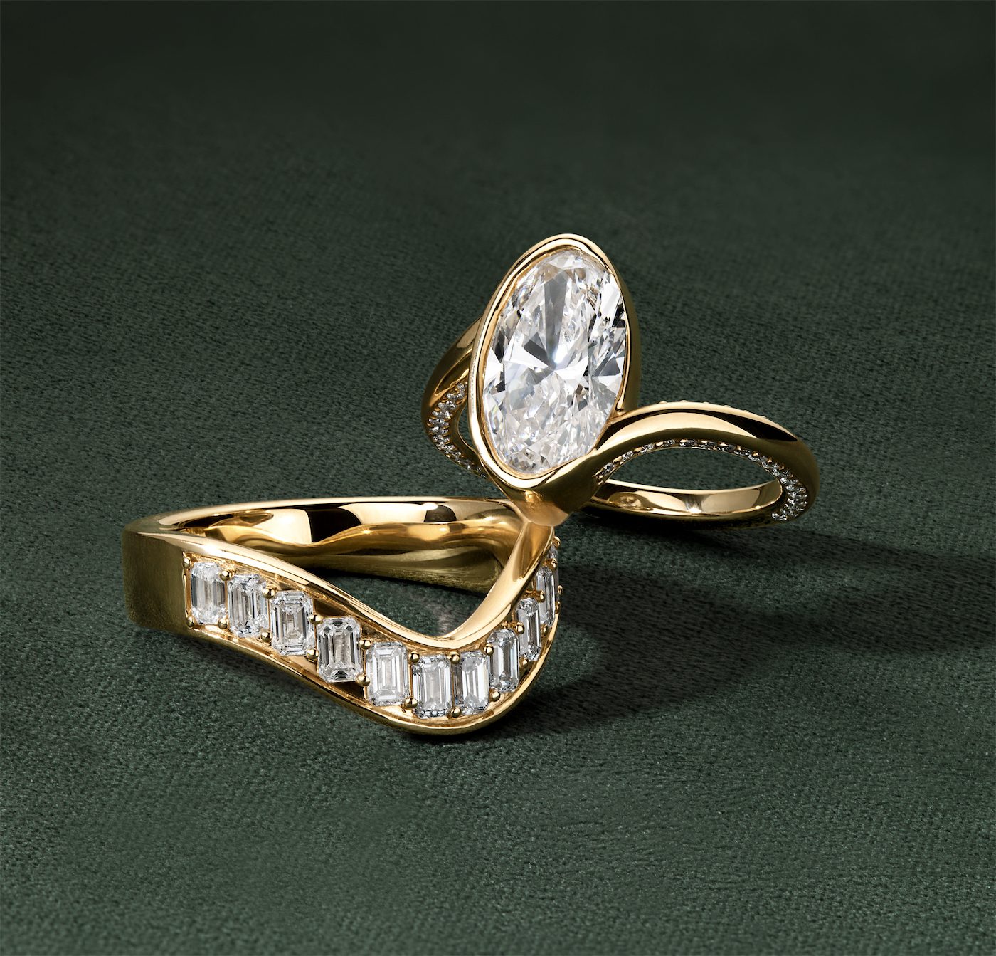
Catalog Product Photo
The clean studio shots that form the backbone of jewelry ecommerce, the type every channel demands because it shows the piece honestly, with nothing competing for attention. Pure white is the gold standard and still what most marketplaces require. But the rule is loosening: platforms increasingly accept off-white and soft neutral backgrounds, and on your own site you have full freedom. There it is worth testing a non-white seamless background, a soft gray, a blush, or a deeper tone, that many pieces actually read better against, since delicate stones and metal can get lost on stark white. It is not one image but a small family of them, and a complete listing needs each one.
Front (Hero)
The straight-on front image with the piece filling most of the frame. It states the design in a glance and follows the piece everywhere: search results, social shares, ads, so it has to be both appealing and honest.
Where it goes: the main product-page and category-thumbnail image, and the required main image on every marketplace. 1 per piece.
Angles
A few more views, not a forensic inventory. For most jewelry that means 2 to 5: a three-quarter that gives the piece dimension, a profile that shows setting height and how it sits on the body, and a back only when the finishing or clasp is part of the story. A plain stud needs 2; a sculptural cocktail ring earns 5. The view brands skip and should not is the profile, because that is where a buyer reads how high a stone sits and whether it will catch on everything they own.
Where it goes: the product-page gallery and marketplace listings. 2 to 5 per piece, driven by the piece.
Macro and Detail
The close-ups that carry the perception of quality: the setting, the prong work, the finish, the hallmarks, the character of the stone. This is where craftsmanship becomes visible and where a high price stops being an argument, because the customer cannot touch the piece and the macro does the inspecting for them.
Where it goes: the product-page gallery, the luxury and resale marketplaces that require hallmark close-ups, and social, where a tight detail of a stone stops the scroll. 1 to 3 per piece.
Scale Reference
Size perception is the single biggest avoidable problem in jewelry ecommerce. A 7mm pendant and a 14mm pendant look identical in a tight crop on white, so the shopper is either guessing or refusing to guess, and both cost you. The fix is almost insultingly simple: 1 consistent scale shot, the piece on a real hand or neck, or beside a coin. Jewelers who add that single frame watch “it is smaller than I thought” disappear from their returns, and that is one of the most expensive sentences in the business, because you pay shipping both ways to learn nothing.
Where it goes: the product-page gallery and every marketplace listing, never optional. 1 per piece.
On-Model
The piece worn by a real person, which answers the question every shopper is really asking: how will this look on me? Models that reflect your actual customer, in natural poses, do more to build confidence than any amount of studio polish.
Where it goes: the product-page gallery, email, social, and ads. On marketplaces it goes in the secondary slots, never as the Amazon main image. 1 to 2 per piece.
Lifestyle and UGC
The piece in a real setting and a real moment: an occasion, a hand around a coffee cup, soft daylight. Lifestyle sells the feeling and the world around the product, which is a large part of what people buy in fine jewelry. The trap is letting the styling swallow the piece, so the product still has to be the clear subject. Its close cousin is UGC, the unpolished customer and creator photos that read as real precisely because they are not studio-perfect; on a product page, a small block of genuine customer shots does more for trust than another glossy frame.
Where it goes: 1 secondary image on the product page for context, plus a “real customers” block where UGC builds social proof, and then the workhorse of marketing: Instagram, Pinterest, email, homepage banners, and ads. 1 to 2 per piece, more for campaigns.
Creative Still Life
The piece composed as an art-directed still life: deliberate props, surfaces, color, and light that build a small world around the product with no model in frame. This is where a brand shows taste and a point of view, turning a single ring into an image people save and share. It is not lifestyle (no body, no candid moment) and not on-white (here the mood and styling are the point), and it is what separates a brand that looks designed from one that looks like a spreadsheet.
Where it goes: the Instagram grid, Pinterest, email, homepage and collection banners, and paid ads. A strong secondary on the product page, rarely the main image. 1 to 2 per piece, more for a campaign.
Fashion Editorial Jewelry Photography
The high-fashion treatment: jewelry shot as a fashion story, on a styled model, with the production values of a magazine editorial. It does not sell a single SKU; it sells the brand’s world and its ambition, the way a campaign does. This is the most expensive tier to produce the traditional way, and the first place AI is rewriting the budget, which we get to below.
Where it goes: campaigns, lookbooks, the homepage hero, PR and press features, and social hero posts. Planned per collection, not per product, and almost never on the listing itself.
360 Spin or Video
A still freezes the one thing jewelry has that a competitor’s photo of the same stone does not: motion. Diamonds were cut to throw light as they move, and a static photo flattens that into a single frozen sparkle that every other retailer of that exact stone also owns. The diamond specialists built their reputation on this: James Allen and Blue Nile pair a smooth 360 with their stills precisely because rotation lets a shopper inspect prongs, facets, and engraving the way they would in a store, and it performs especially well on mobile, where most jewelry browsing now happens.
Where it goes: the product-page gallery, social as a Reel or short clip, and the single video slot most marketplaces now allow. 1 per piece.
Where Those Photos Go: Marketplaces and Beyond
The Marketplaces
What matters is not the platform ceiling, it is the floor: the fewest photos a listing needs to convert instead of look thin. For jewelry that floor is about 5 to 7, a hero, a couple of angles, a macro, a scale shot, and ideally an on-model. Add more where the channel gives you room. By platform:
- Amazon (mass and mid-market): at least 5 to 7, with room for up to 9. The main image for jewelry must be the product shot flat on a pure white background (RGB 255, 255, 255), filling at least 85% of the frame, no model, no props, no text. Necklaces may be cropped; nothing else.
- Etsy (handmade and vintage): at least 5 to 7, with room for up to 20 plus a video, so add lifestyle and stacking shots.
- eBay (resale and collectible): at least 5 to 7, with room for up to 24. A clear front, back, and macro keep a listing out of dispute.
- Walmart Marketplace (mass and value): at least 4 to 6, with room for up to 10, on a clean white background with no watermarks or text.
- Poshmark (trend and fashion jewelry): at least 4 to 6, with room for up to 16, ideally on a person or as a clean flat lay.
- Mercari (general resale): at least 4 to 6, with room for up to 10, simple and unobstructed.
- Ruby Lane (vintage and antique): at least 6 to 8, with room for up to 25, showing age and condition honestly, with no stock photos.
- 1stDibs (fine and luxury, curated): at least 6 to 8 gallery-level images, with room for up to 10, multiple angles and no watermarks, because the buyers expect it.
- The RealReal (authenticated luxury resale): you do not upload photos. You consign the piece and their team shoots it to a fixed standard, including macro shots of hallmarks that prove authenticity.
- Worthy (luxury and estate auction): consignment too. They photograph the piece, hallmarks, stones, and condition for the auction, because buyers bid on what they can see.
The pattern across all of them is the same. The main image earns the click, the rest close the doubts, and the strict white-background rule on the mass channels should never become the only kind of photo you bother to shoot.
Social, Email, and Ads
The same shoot has a second life the moment it leaves the product page. The macro and the 360 become Reels and Pins, the creative still life and lifestyle frames carry the email and the paid ads, and the on-model and editorial shots do the convincing in both. The discipline shifts: a product page rewards completeness and honesty, while social rewards stopping the scroll, which is a different brief entirely. A flawless studio shot can be the wrong tool on a feed that runs on motion and personality, the tension we unpack in why perfect product photos can hurt sales. Plan the channel split before the shoot, not after, and the deeper playbooks are in photography by platform, Instagram photography for jewelry, and Pinterest for jewelry.
Jewelry Photography Done Right
What Makes Jewelry Different
The shot list looks a little like any product. The execution does not, because jewelry breaks the usual rules in 4 specific ways, and each one decides whether a gallery builds confidence or seeds doubt.
- Macro is the main event. The value lives in details measured in millimeters: the cut of a stone, the quality of a setting, the stamp of a hallmark. That requires real macro work and depth of field, not a phone crop, because the close-up is the proof of quality.
- Metal and stones reflect everything. Polished surfaces mirror the room, the rig, and the photographer. Controlling reflections with diffused light and the right setup is most of the craft, and it is the difference between brilliance and a distracting glare.
- Color has to be true. Accuracy stops being a nice-to-have the moment a buyer is choosing between yellow and rose gold or judging a sapphire they cannot hold. A too-warm white balance erases the very distinction that drives the decision, and a ring that photographs slightly green is a return waiting to happen. Represent stones honestly, variation and all, because enhancement that oversells the sparkle just moves your problem from the product page to the returns desk.
- Sparkle only reads in motion. The brilliance that makes a piece worth wanting fully shows up under the right light and in movement, which is why the 360 earns its place and why lighting that is too dramatic reads as a piece that will disappoint in the box.
Aim for honest brilliance: enhance the natural beauty while representing how the piece genuinely looks in normal light. Create the wow, then make sure the box that arrives delivers it. The line between flattering and misleading is the whole subject of honest retouching.
Gallery Order Is Persuasion
Having the right photos is half the job. The order you put them in is the other half. Consider 2 galleries for the same ring. Gallery A is technically excellent but randomly ordered: a back view first, then a macro, then the hero. Gallery B runs the buyer’s natural sequence, and it converts better without a single new photo, because order is a form of argument. A reliable sequence:
- Hero shot that states the overall design.
- Detail and macro that prove quality.
- Scale and on-model so the buyer can place it on their body.
- The 360 or movement clip for inspection.
- The remaining angle and any creative frame to close the last doubts.
Let Your Returns Write the Shot List
Document your standards, the lighting, angles, background, and benchmarks, so the catalog stays consistent across photographers and over time. Consistency reads as professionalism; inconsistency reads as risk. Then close the loop with data, because opinions about photography are cheap and returns data is not. Scan returns and customer-service messages for problems a better photo would have prevented, watch reviews for any “looked different than the picture,” and treat each one as a free brief for the exact shot your gallery is missing. The expensive sentences your customers write are, if you let them be, your next shot list.
From One Piece to a Full Gallery
The best jewelry product photography is not the prettiest. It is the most complete for the fewest frames: a core set that answers every question, builds confidence, and trims cleanly to fit your product page, every marketplace, and the feed. Beautiful photography that leaves a question open is just expensive decoration.
That is the work Tuple Strategy does. We take a brand’s product, even a single clean reference shot, and produce the full set around it: on-white and macro, scale, on-model, lifestyle, creative still life, editorial, and the 360, built with human art direction, our own model trained on fashion, jewelry, and beauty, AI for the environment and variety at scale, and hand retouching that keeps the piece true, then cut to fit your site, every marketplace, and social. One piece in, a complete content set out. Tell us what you are launching, and we will show you what your catalog could look like.