

SKKN by Kim Didn’t Make It. Its Visual Identity Did.
SKKN by Kim rose fast. It launched in 2022 and, in a short window, built the kind of recognition most beauty brands chase for a decade. Part of that was Kim Kardashian’s reach, which no competitor could match. But reach alone doesn’t explain the look of the thing. SKKN arrived with a visual identity so deliberate and so consistent that it did real work: it made the brand legible in a second and premium on sight.
In 2025 Kim wound the brand down to fold her beauty efforts into Skims Beauty, announced for 2027. That was a business decision about where to put her energy, not a verdict on the work. The visual strategy that helped SKKN climb still stands on its own, and that is what this piece is about: a close look at the choices that made the brand’s imagery pull its weight, so you can borrow them.
What made SKKN’s visual branding strong
It told one story and stuck to it
SKKN built its identity around a narrative that was easy to repeat: skincare as a calm, considered routine rather than a shelf of loud products. The pitch was restraint, and the visuals backed it up. Photography, packaging, and the brand’s social presence all spoke in the same low voice. Many beauty brands say “clean” or “minimal” in a headline and then contradict it in the feed. SKKN didn’t.
That consistency is harder than it looks, and it’s the first thing worth stealing from this case: it’s what turns a look into a brand people recognize.

Minimalism with a purpose
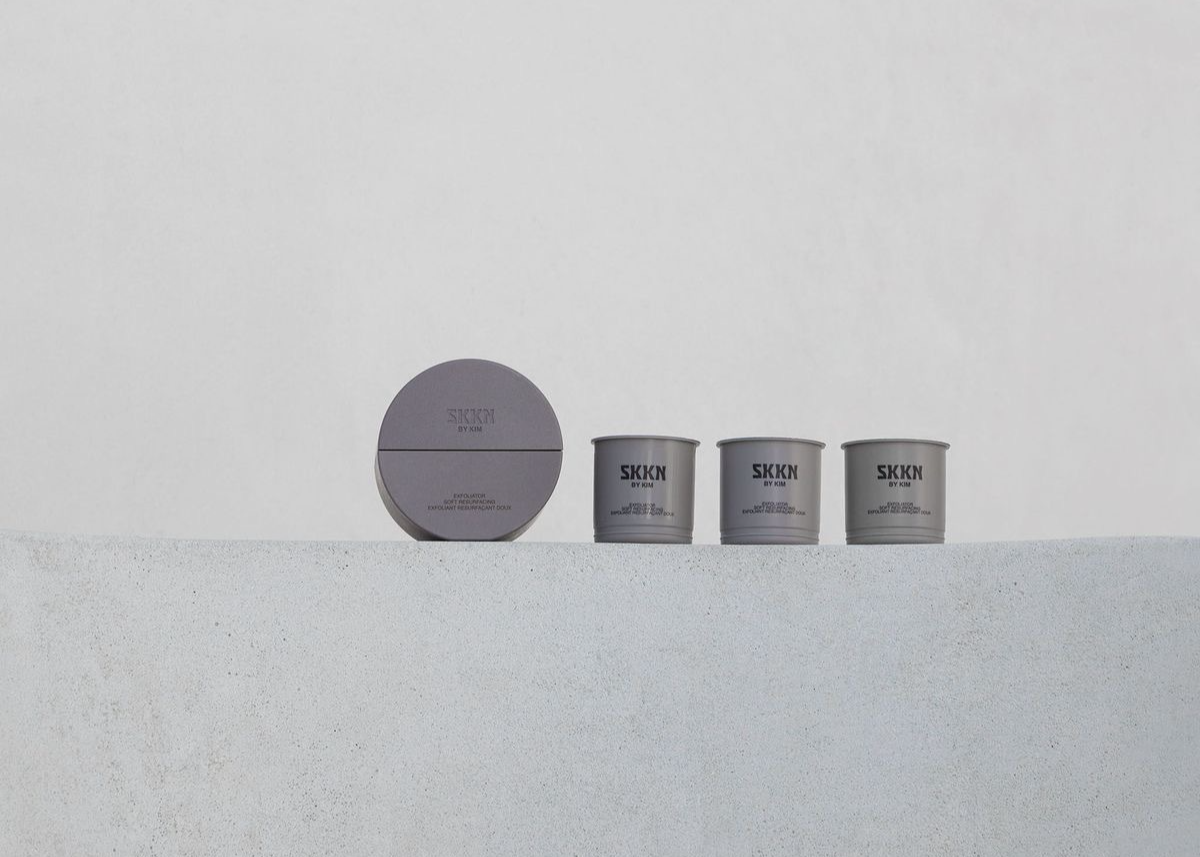
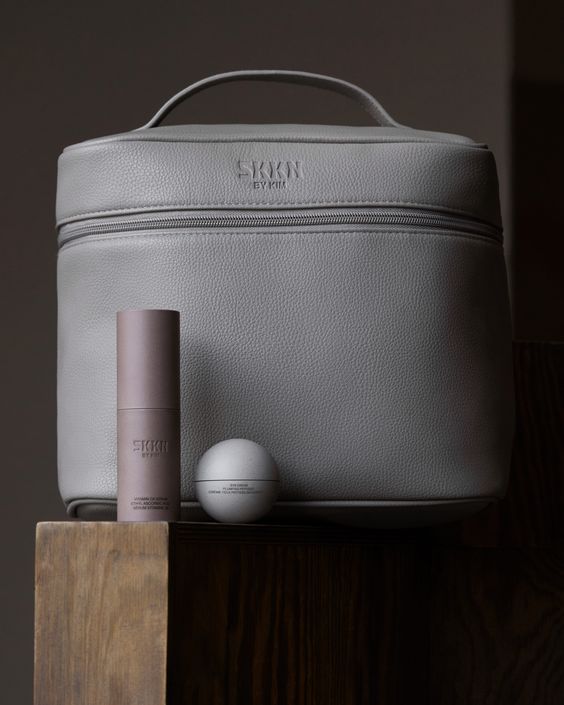
Plenty of brands go minimal because it photographs well. SKKN used minimalism as an argument. Empty space, neutral surfaces, and tightly edited compositions signaled that the product didn’t need decoration to justify itself. The look said: fewer steps, fewer claims, nothing to hide.
The tell of purposeful minimalism is that you can explain every omission. SKKN could. The absence of clutter was the message, not a lack of ideas.

Transparency and a focus on ingredients
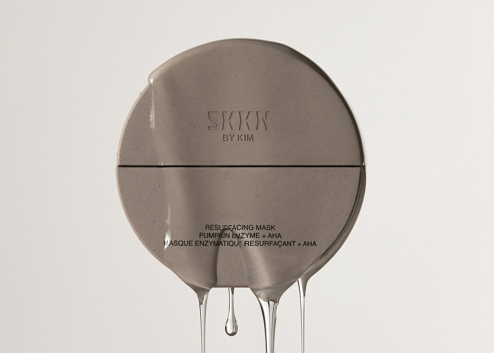
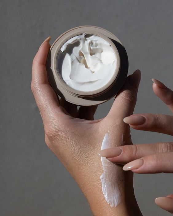
The visual language leaned on the idea of showing what’s inside. Product-forward imagery kept the formulation, rather than the lifestyle, at the center of the frame. In a category where “science-backed” is often a sticker on a pretty jar, putting the substance in front of the camera was a credible move, and it fit the calm, clinical register the rest of the brand used.
Unretouched skin
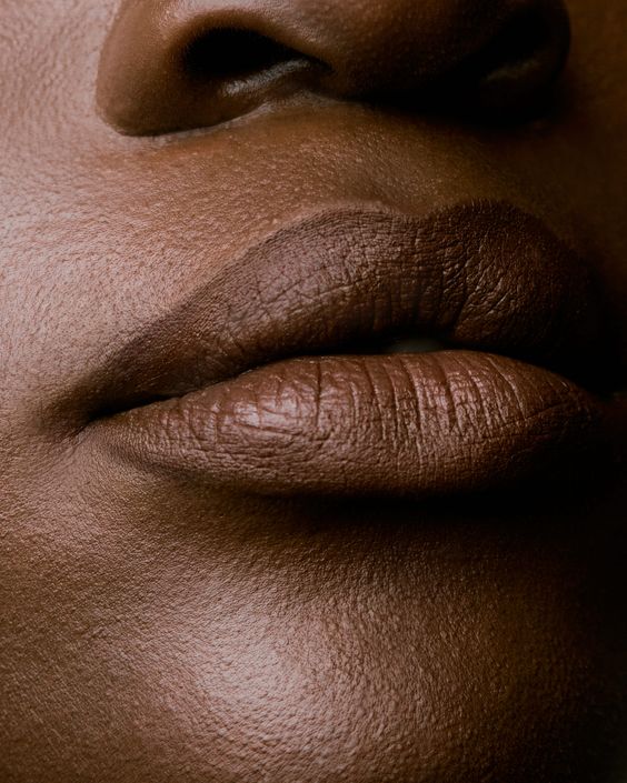
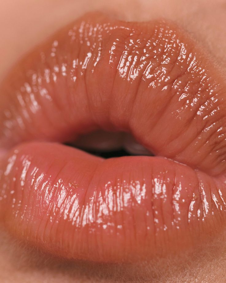
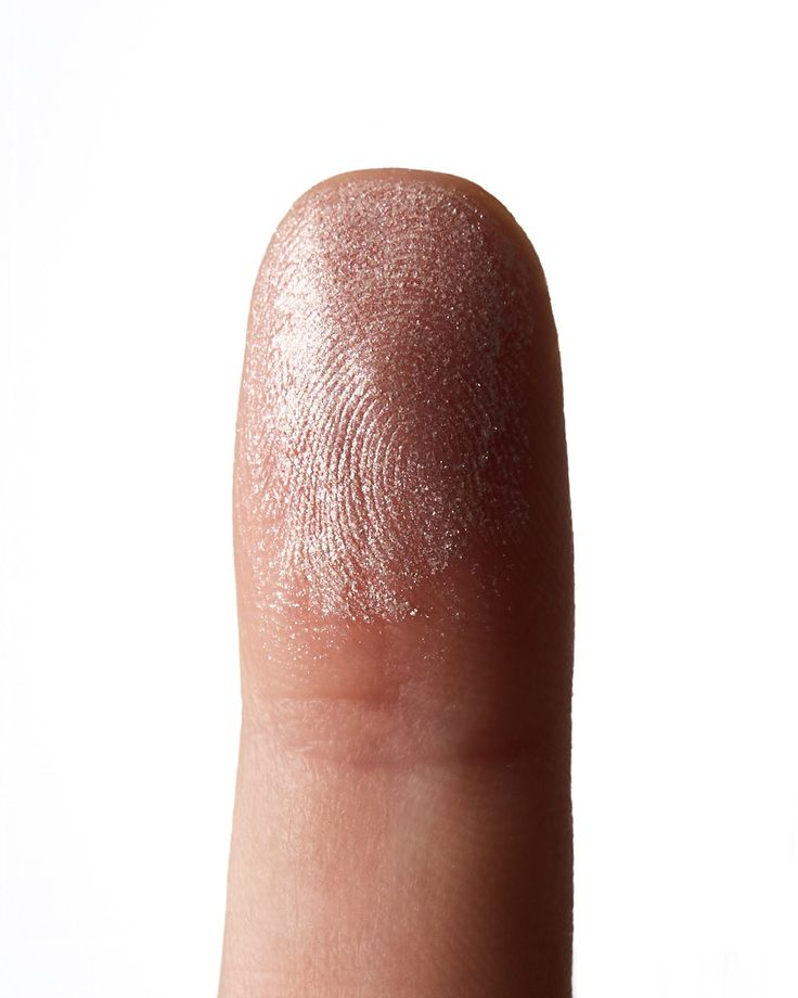
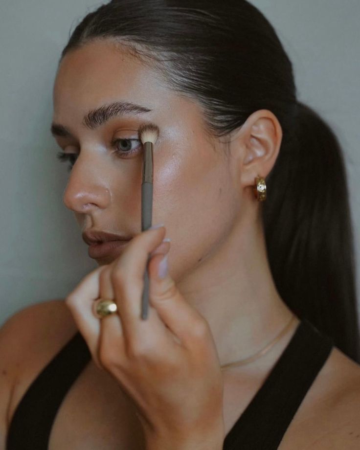
The skin in SKKN’s imagery looked like skin. Texture, pores, and natural variation stayed visible instead of being smoothed into the glassy finish that skincare advertising has leaned on for decades. For a skincare brand this is the single most important visual decision, because the product’s promise lives on the face. Showing believable skin makes the promise feel testable, and that reads as confidence.
It also lined up with the audience’s growing impatience with filtered perfection. A brand selling skin health that shows believable skin is being consistent, and consistency is persuasive.



Blue tones and scientific imagery
Cool blues and lab-adjacent visual cues gave the brand a clinical, almost pharmaceutical calm. That palette carries a specific association: precision, cleanliness, something that has been tested. It’s a well-worn route in skincare, and SKKN’s execution kept it restrained enough to feel designed rather than borrowed.
The choice also separated the brand from the warm, glowy, wellness-adjacent look that crowds the category. On a shelf or a feed full of peach and gold, a cooler palette stands out for free.
A clear picture of who it was for
SKKN’s imagery implied a specific customer: someone who treats skincare as a routine, wants a pared-down regimen, and is drawn to the authority of a science-flavored brand. The styling and tone were written for that person and not for everyone. A visual identity with a defined reader is easier to execute and easier to judge, which is part of why this one holds up as a study.

Faces that matched the claim
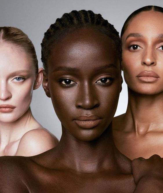
The casting reinforced the positioning. Models spanned a range of skin tones and ages, including multigenerational faces, and were photographed in confident, direct poses with minimal styling. The effect was a brand that looked built for real skin on real people, not a single idealized face.
That matters for credibility in skincare more than almost any other beauty category, since the product has to work across tones, textures, and ages, and the imagery is where a brand first makes that promise.
Shot styles that did the work
The shot list was disciplined: clean backgrounds, restrained compositions, and product and skin treated with equal seriousness. Tight framing let texture carry the argument, and a consistent set of shot types kept the visual rhythm steady across the brand’s channels.
Taken together, this was competent, coherent art direction. Scored on visual strategy, SKKN earns high marks, and those marks are the reason the brand became recognizable so quickly.


What a brand can take from this
SKKN is a case study in visual discipline, and the lessons hold wherever the brand goes next.
– Pick one story and commit to it. SKKN’s restraint read as confidence because nothing in the feed argued with it. Consistency is what turns a look into a brand. – Make minimalism mean something. Empty space worked because it carried an argument about the product, not because it photographs well. – Show the truth the product promises. Honest skin and ingredient-forward framing made the claims feel testable, which is rare in beauty. – Cast and shoot for the customer you named. A defined audience made every styling and shot decision easier to judge, and the imagery felt built for real people.
A famous founder opens the door. A disciplined visual identity is a big part of what makes people stop, trust the brand on sight, and remember it. SKKN got that part right, and it’s worth borrowing whatever you sell.