11 Jewelry Brands That Are Hot on Instagram Right Now
For jewelry brands, Instagram is a platform where trends are born, aesthetics are shaped, and entire customer relationships unfold in public. Some brands have absolutely nailed the art of living in this space. They don’t just post to create the visibility of activity. They build a vibe, a voice, and a following that actually sticks, contributes to their reputation, and sooner or later, buys.
Here are 11 jewelry brands that are doing cool things on Instagram right now, from sculptural minimalists to maximalist chaos-in-a-good-way. Each one is doing something you can learn from.
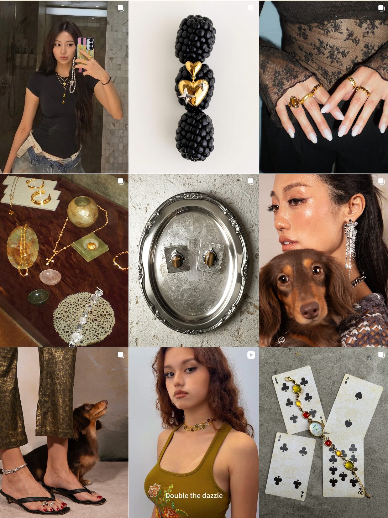
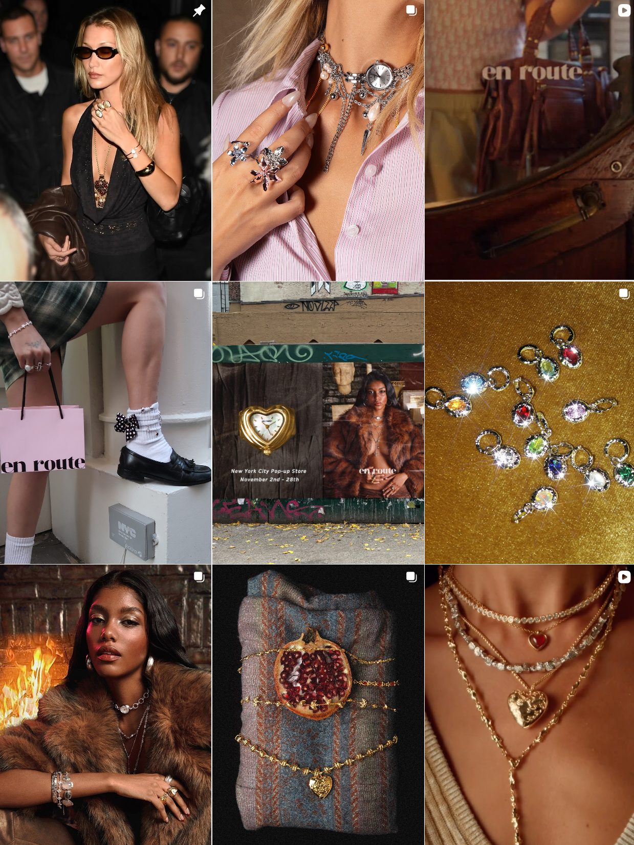
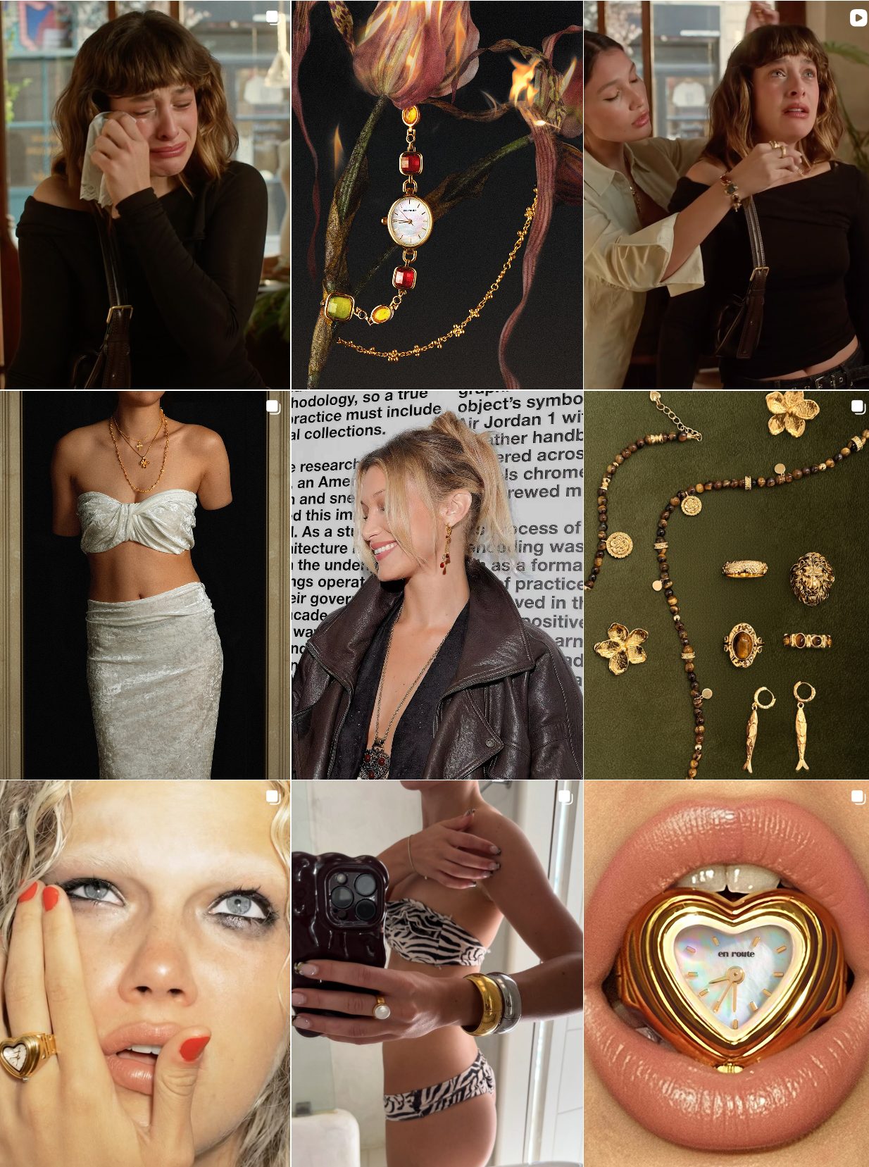
En Route: Trendy, Affordable Jewelry for Gen Z on Instagram
En Route doesn’t pretend to be timeless or minimalist. It embraces fast trends, fast content, and fast feedback. Their strategy is rooted in volume and relevance: frequent drops, regular collabs with micro and mid-tier influencers, and a feed that’s always shifting to match whatever Gen Z is vibing with that month (Y2K? Fairycore? Minimalist-core? They’ve done it all).
Most posts are either:
- Unfiltered UGC (user-generated content) with tags and reposts
- Model shots that look like Instagram photos, not campaigns
- Memes and conversational captions written like DMs, not ads
They’re also quick to pivot. En Route tests new styles, packaging ideas, or aesthetics directly on their feed. Comments become feedback loops. Nothing is precious, and that’s what makes it feel alive.
Why it works:
For an audience that lives in Instagram DMs and TikTok sounds, En Route meets them where they are. It doesn’t need a “grid curated aesthetic”; it needs relatability and speed. Their feed feels like it belongs to a friend who always knows what’s cool right now, and that turns young followers into buyers fast.
En Route Instagram
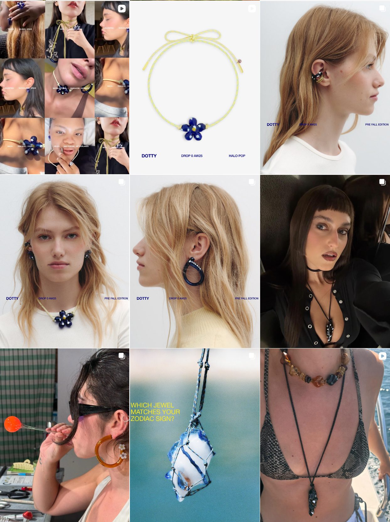
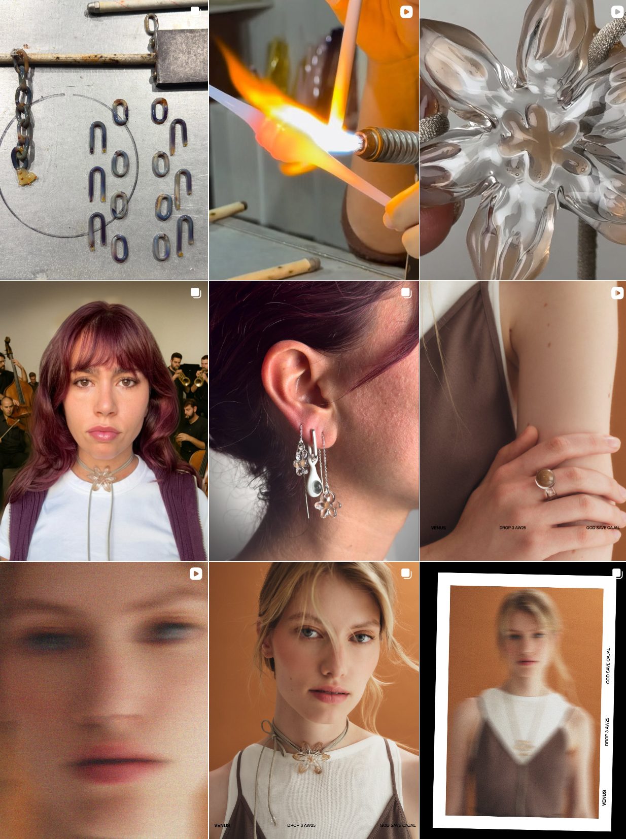
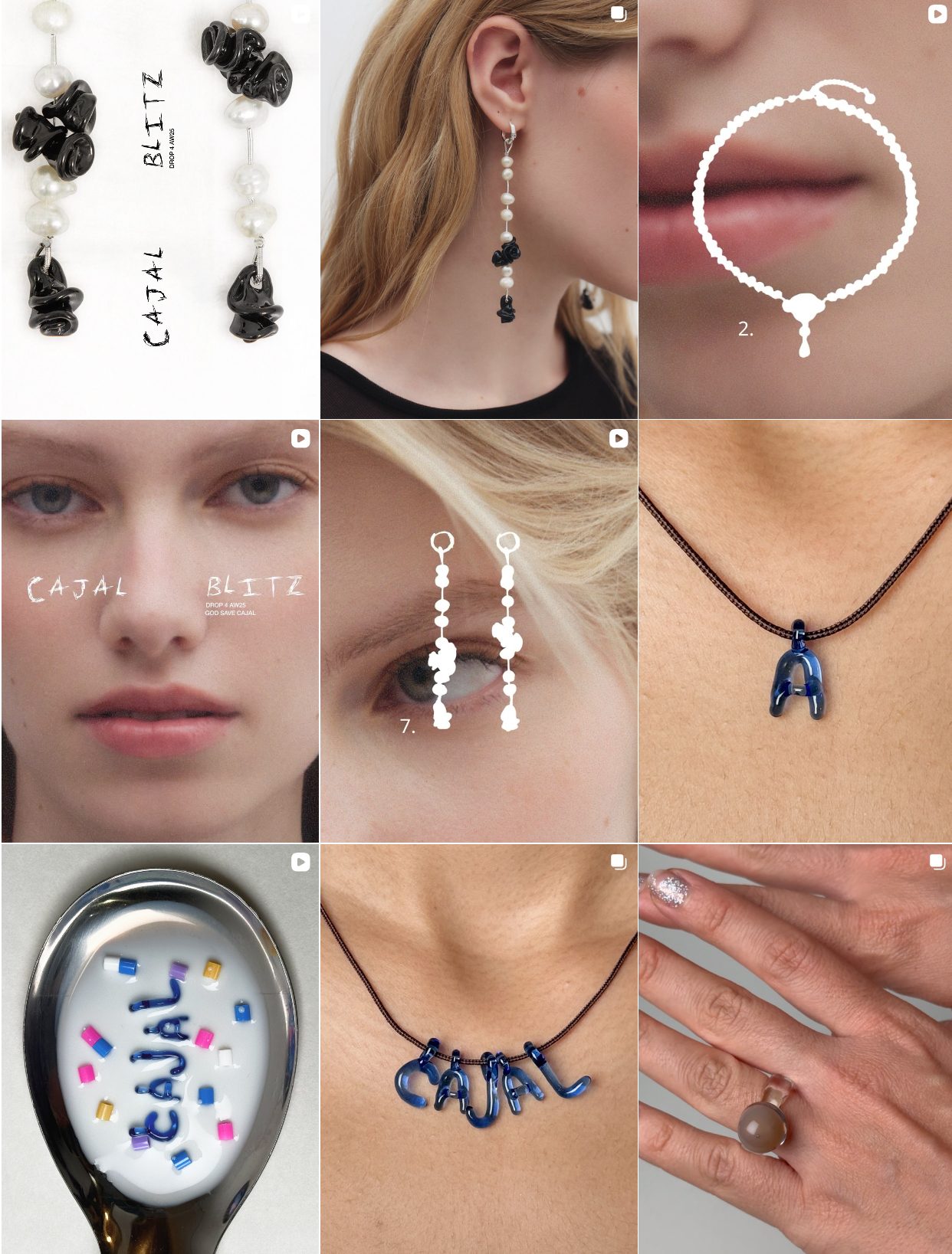
CAJAL Minimalist Jewelry with a Youthful Aesthetic
CAJAL is restrained, refined. Their entire Instagram strategy centers on the absence of gloss or commercial clutter. Their feed is composed of gentle lighting, bare skin, abstracted backdrops, and product shots that often feature only part of the jewelry. It’s about creating intrigue through what’s not shown.
They usually use a very limited color palette: ivory, beige, blue hues, and natural tones. Captions are sparse or poetic. Highlights are clean. Even stories feel meditative, say, soft pans, unhurried product reveals, and ambient sounds.
Lesson for Brands:
CAJAL taps directly into the “low-key” and “anti-hype” trend, which exploded post-2022. Their Instagram feels like a break from the scroll, and that intentional contrast makes them stand out. It attracts followers who are tired of being sold to and prefer discovery through vibe rather than CTA.
The key tactic here is not just minimalism, but the emotional effect of pacing. Slow visuals, soft light, and visual silence draw the user in, creating space for meaning and desire.
CAJAL Instagram
AGMES Sculptural Modern Jewelry That Shines on Instagram
AGMES’ strategy is rooted in visual architecture. Their pieces, often made of silver or freshwater pearls, are styled to reflect structure and asymmetry, and their Instagram mirrors that. Each post feels like a still from a design magazine: sharp shadows, spatial depth, and lots of white space. Their content mixes:
- Isolated product shots styled on curved pedestals or marble
- Editorial shoots with models styled in monochrome or black turtlenecks
- Process-based content like behind-the-scenes casting, polishing, or hand-finishing
- Occasional reposts from stylists or fashion editors showing AGMES layered into designer looks
There’s almost no attempt to “trend chase” or force relatability; instead, they cultivate a timelessness that appeals to the design community, creatives, and slow fashion advocates.
Why it works:
AGMES plays the long game. Their audience doesn’t want dopamine-scroll content; they want confident authority and craftsmanship. Their feed is consistent in tone, layout, and rhythm. That trust-building visual identity translates to higher perceived value and a customer base that sees their jewelry not just as an accessory, but as a collectible design.
AGMES Instagram
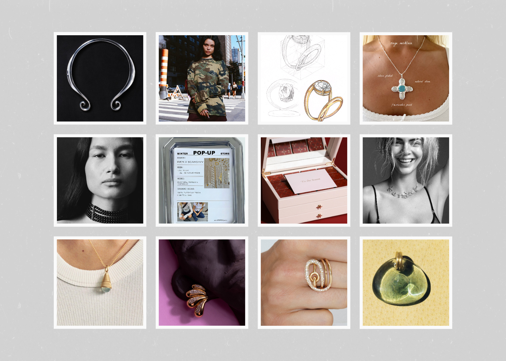
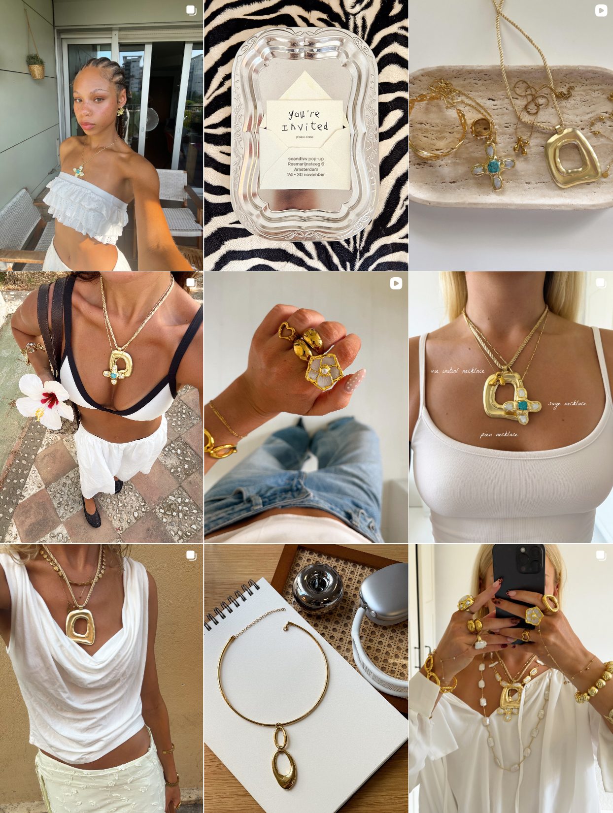
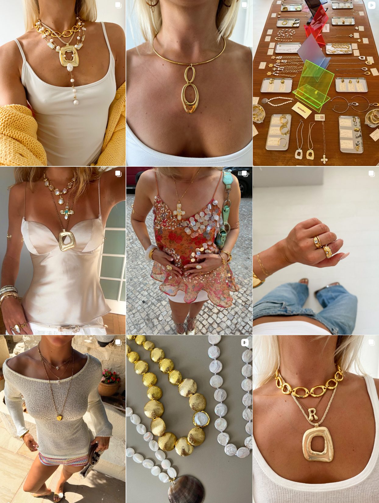
SCANDIVV Label: Bold Scandinavian Jewelry with a Disruptive Instagram Identity
SCANDIVV’s Instagram is a masterclass in balancing boldness with playfulness. Instead of moody minimalism or cool detachment, their feed leans into sunny tones, high-shine gold, nostalgic design elements, and an approachable, confident energy. Here’s what stands out:
Flip phones, zebra-print trays, and handwritten tags give their aesthetic a low-key early-2000s vibe without being full-blown kitsch. It feels like Y2K filtered through a contemporary editorial lens. Some images feature small, simple-font product annotations (e.g., “silver-plated / natural stone / freshwater pearl”) to educate the customer in a subtle, design-led way. Their models (often sun-kissed, Gen Z-coded) are photographed in real-world spaces like balconies, minimal interiors, and outdoor light. It creates a “real girl, real luxury” vibe.
Tactics to explore:
SCANDIVV doesn’t take itself too seriously, and that’s its strength. There’s a commercial logic to the content (clear product visibility, consistent styling), but it’s wrapped in warmth, personality, and visual charm. It doesn’t sell “fashion girl exclusivity”, it sells the feeling of discovering a cool indie label before everyone else does.
SKANDIVV Label Instagram

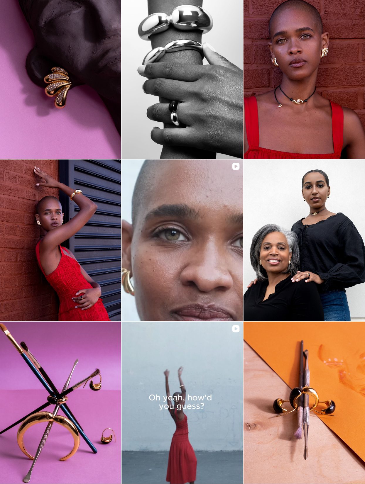
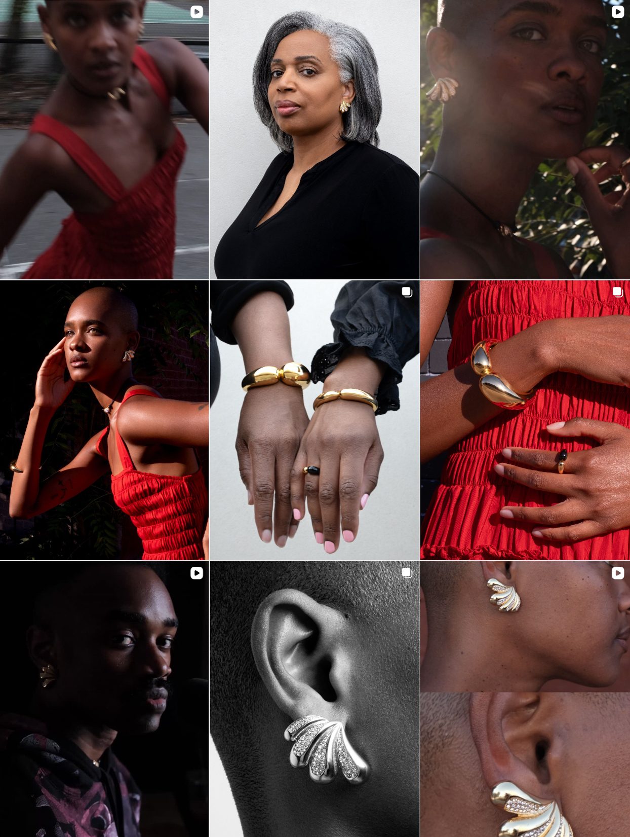
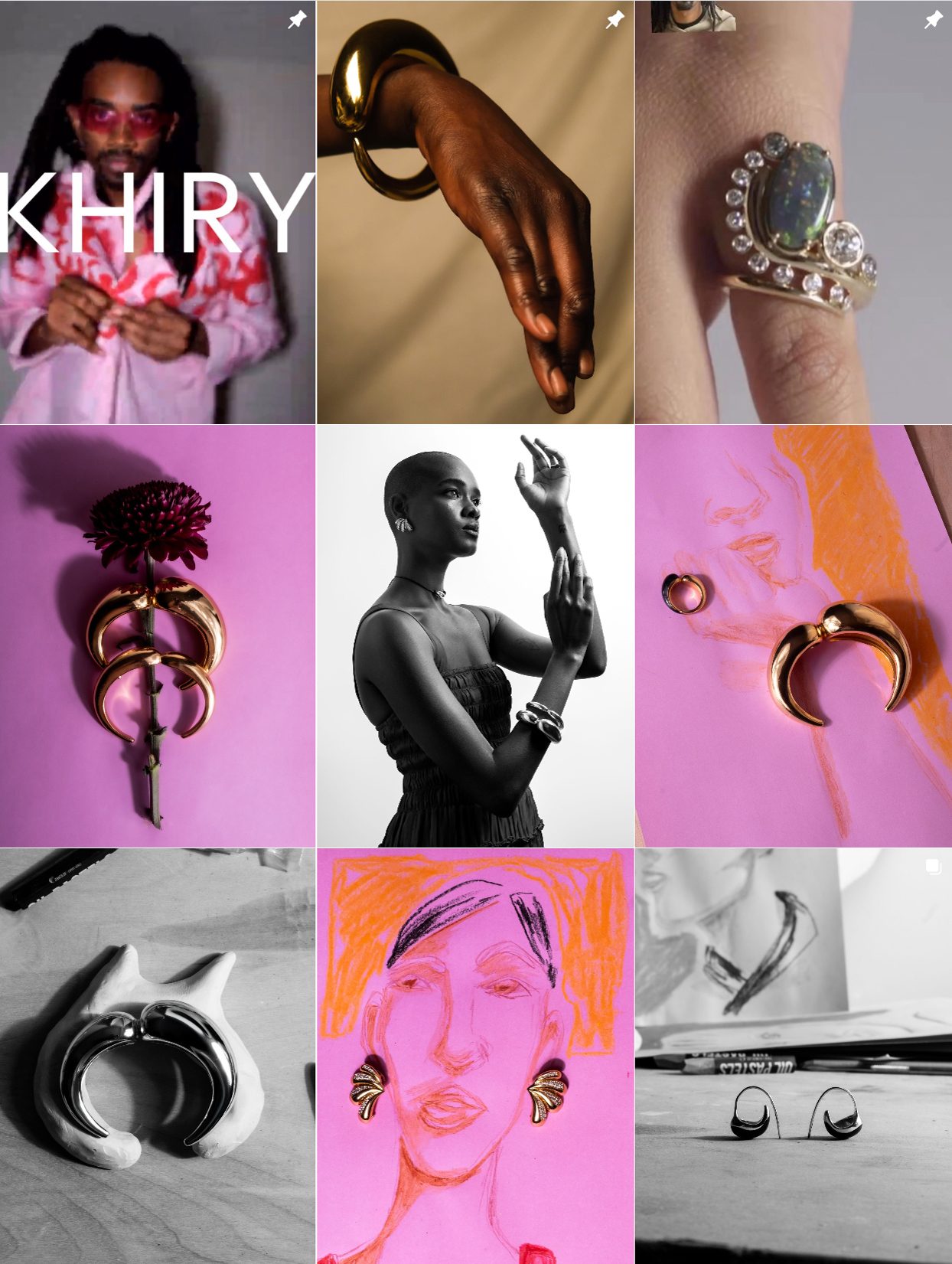
KHIRY: Afrofuturist Jewelry Brand Elevating Instagram Storytelling
Instead of filling the grid with product close-ups and commercial-style eCommerce images, KHIRY builds a mood. Editorial photos sit alongside fine art portraits, behind-the-scenes footage of founder Jameel Mohammed’s process, and museum-quality lighting setups. There are recurring themes of Black beauty, mythology, futurism, and resistance, not explained with captions, but shown through images.
Their products often blend into the narrative. A bracelet appears in a cinematic shot of a model staring down the camera. An earring rests subtly in a still life surrounded by fabric or sculpture. The storytelling comes first; the product reveals itself second.
Why it works:
Instagram rewards brands that tell stories visually, and KHIRY treats each post like a standalone page from a visual novel. It builds a sense of cultural depth that draws in fashion insiders, artists, and culturally engaged audiences. For a luxury brand with a political message, this form of slow storytelling and intentional pacing is what creates long-term loyalty and high perceived value.
Read our full case study on Khiry’s Instagram strategy!
KHIRY Instagram
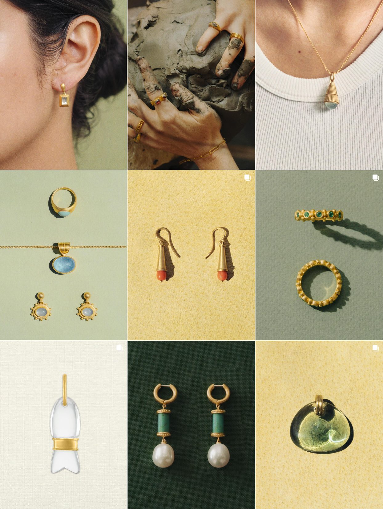
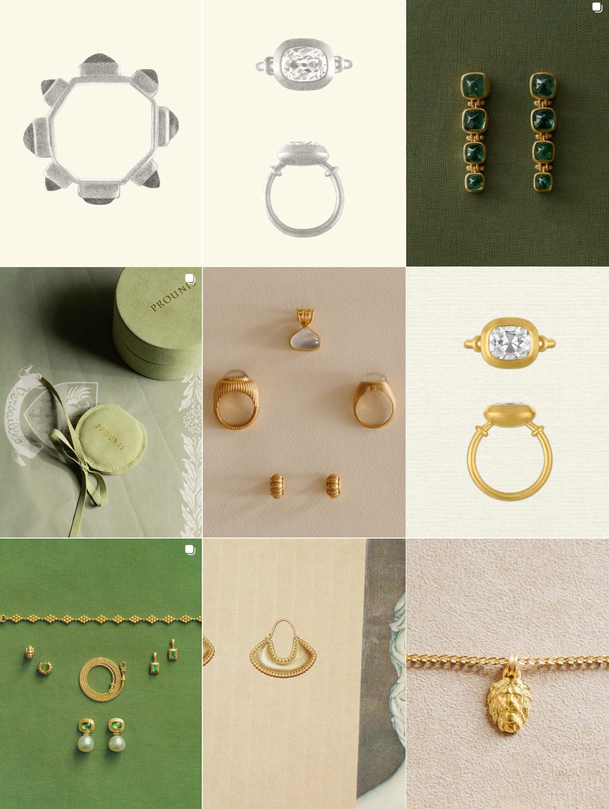
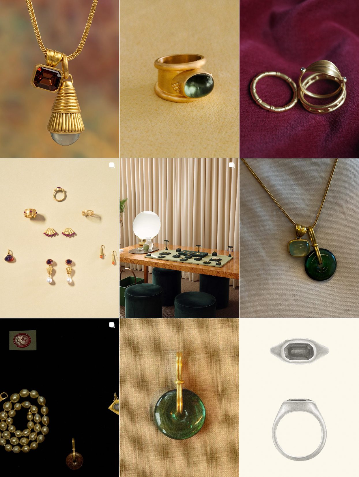
PROUNIS Ancient-Style Gold Jewelry with Story-Driven Visual Language
PROUNIS feels like an heirloom, and their Instagram reinforces that at every level. Their gold pieces are hand-wrought and deliberately irregular, often inspired by ancient Greek, Byzantine, and Etruscan jewelry. Their visual content reflects that: soft shadows, deep golden lighting, and natural surfaces like stone, wood, or raw fabric.
The product is often photographed close-up on skin, not as a “look,” but as part of a tactile experience. Posts alternate between worn jewelry in timeless editorials, flat lays that feel like archaeological tableaus, and rare BTS shots of their New York studio.
Importantly, PROUNIS avoids Instagram “speed culture” altogether. Their posting is intentional, paced, and rarely aggressively promotional. Captions often reference art history, philosophy, craft lineage, or current events of the brand’s life, elevating each post from ad to journal entry.
Why it works:
They’ve built a luxury brand rooted in intellectual depth and material honesty. PROUNIS doesn’t ask you to shop, but it invites you to explore. Their Instagram works because it slows you down and makes you believe in the object, not just the brand.
PROUNIS Instagram
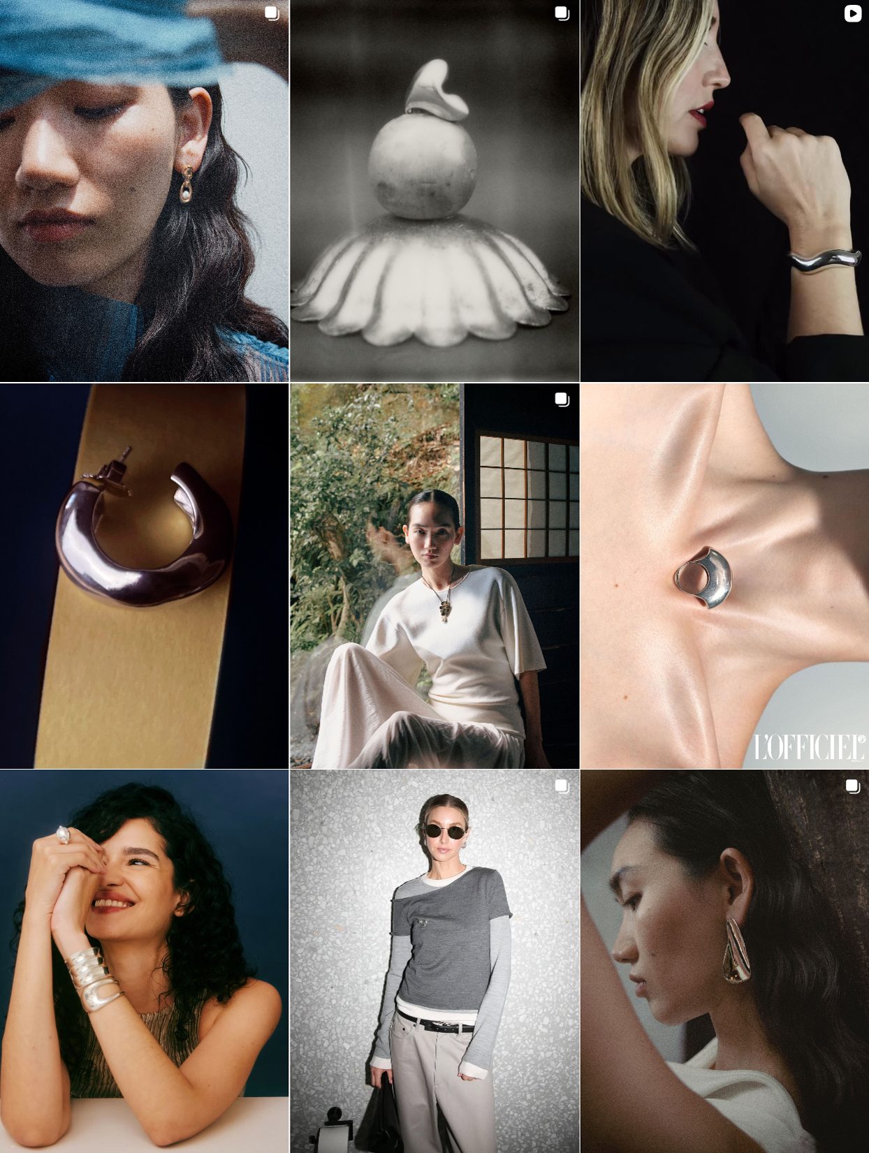
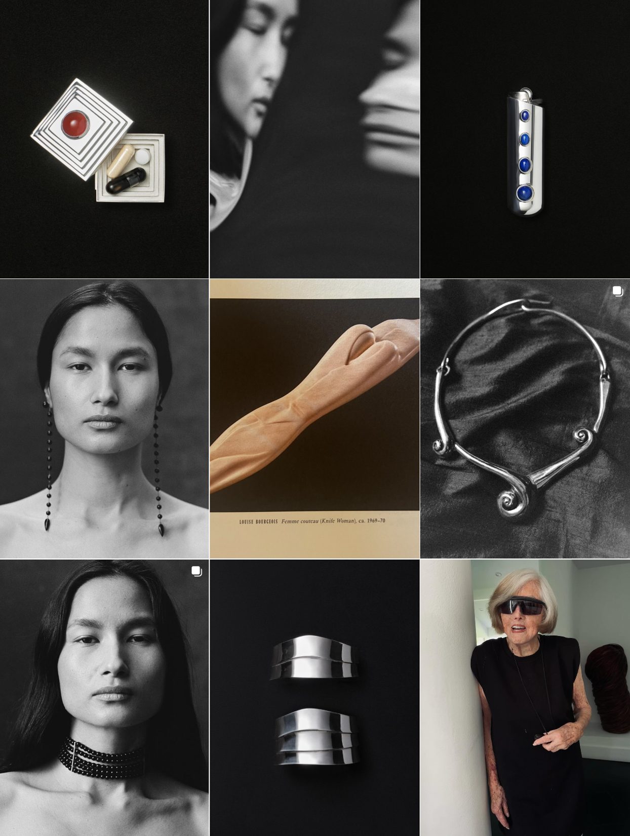
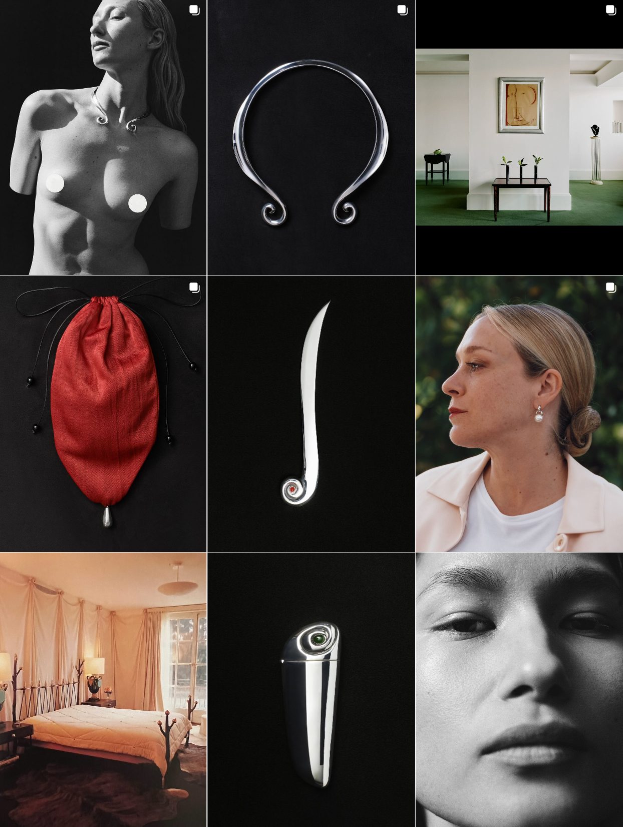
Sophie Buhai Sculptural Silver and Art Direction as Philosophy
Sophie Buhai curates an entire visual world. Her Instagram is a design manifesto. The feed is meticulously paced and curated, combining sculptural still lifes, Bauhaus-inspired objects, black-and-white portraiture, and pieces that feel more like relics than retail.
The core of visual strategy is sculptural rigidity and soft emotion. The brand’s imagery is rooted in tension: smooth curves dance with hard shadows, sharp silver meets blurred motion. Flat lays are never flat, as the surfaces (velvet, raw silk, black marble) add depth and materiality.
Occasionally, a face breaks through the abstraction. When it does, it’s often a character, not a model: an elderly woman with iconic style, a blurry close-up, or a timeless portrait in 3/4 profile. The brand’s palette is deliberate: bone, silver, ivory, black, forest green, rust. Pops of red or cobalt appear as punctuation. Even product shots of new designs are treated like archival discoveries.
Lifestyle without “lifestyle” instead of aspirational vacation photos or trendy interiors, the “lifestyle” moments here are haunting: a sparse bedroom with velvet drapes. A stack of design books. A candle shot like it’s on the altar of a modernist shrine.
Tactic to steal:
Sophie Buhai’s Instagram is about discipline in visual structure, tone, rhythm, and reference. Her grid is the visual equivalent of a brand that knows exactly who it is and doesn’t need to pander. This kind of identity-building works when the brand has long-term confidence, knows its aesthetic lineage (Bauhaus, Brutalism, 90s Helmut Lang), and resists digital fast trends.
Sophie Buhai Instagram
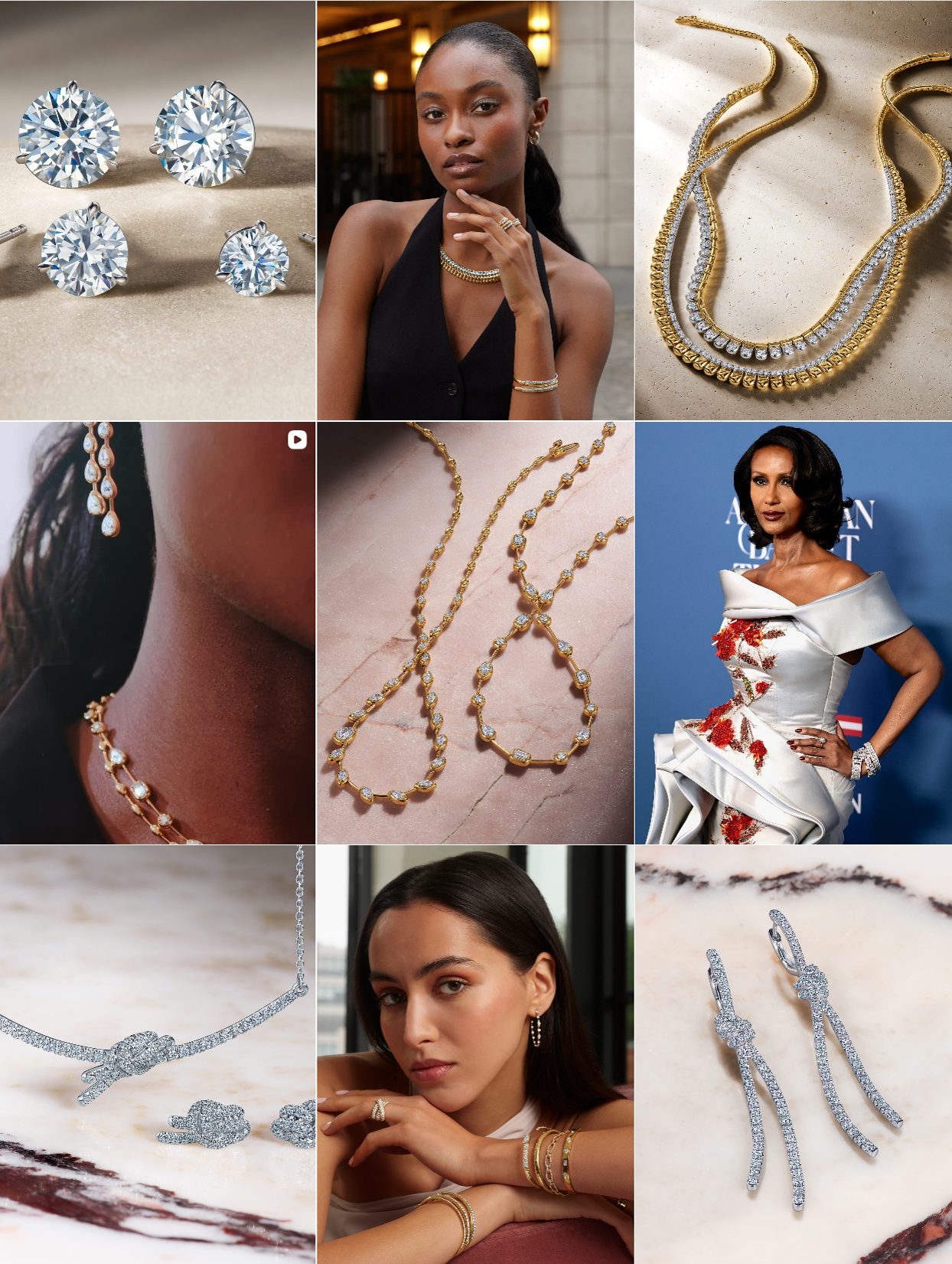
Kwiat Diamonds: Classic Glamour with a Modern Twist
The Instagram of Kwiat diamonds doesn’t reinvent the wheel; it polishes it until it gleams. And that’s intentional. This is a heritage brand with over 100 years in fine diamond craftsmanship, and its feed reflects precisely that: timeless elegance reinterpreted for today’s luxury content standards.
Kwiat’s grid leans into clean, luminous product photography and subtle storytelling. There’s no clutter, no heavy color correction, just clear images that showcase the detail and brilliance of their diamonds. Key visual elements:
Neutral or pastel backdrops: light peach, champagne gold, warm beige, all subtly associated with elegance and femininity.crispy, harsh light and silky textures (like satin or velvet) to create depth and tactile contrast. Product shots and on-model shots are balanced almost 50/50, a rare discipline for a fine jewelry brand. You’re not confused about what’s being sold, but you also don’t feel like you’re watching QVC. Many heritage brands go full tabloid when posting celebrity moments. Kwiat doesn’t. They weave red-carpet placements into their feed seamlessly so it doesn’t disrupt the grid’s warm, cohesive vibe.
Why it works:
This isn’t a brand trying to be edgy or young; it’s a brand doubling down on what works for their audience: clarity, consistency, sophistication. Their Instagram looks like how their diamonds feel: elegant, unshakable, eternal.
Kwiat Diamonds Instagram
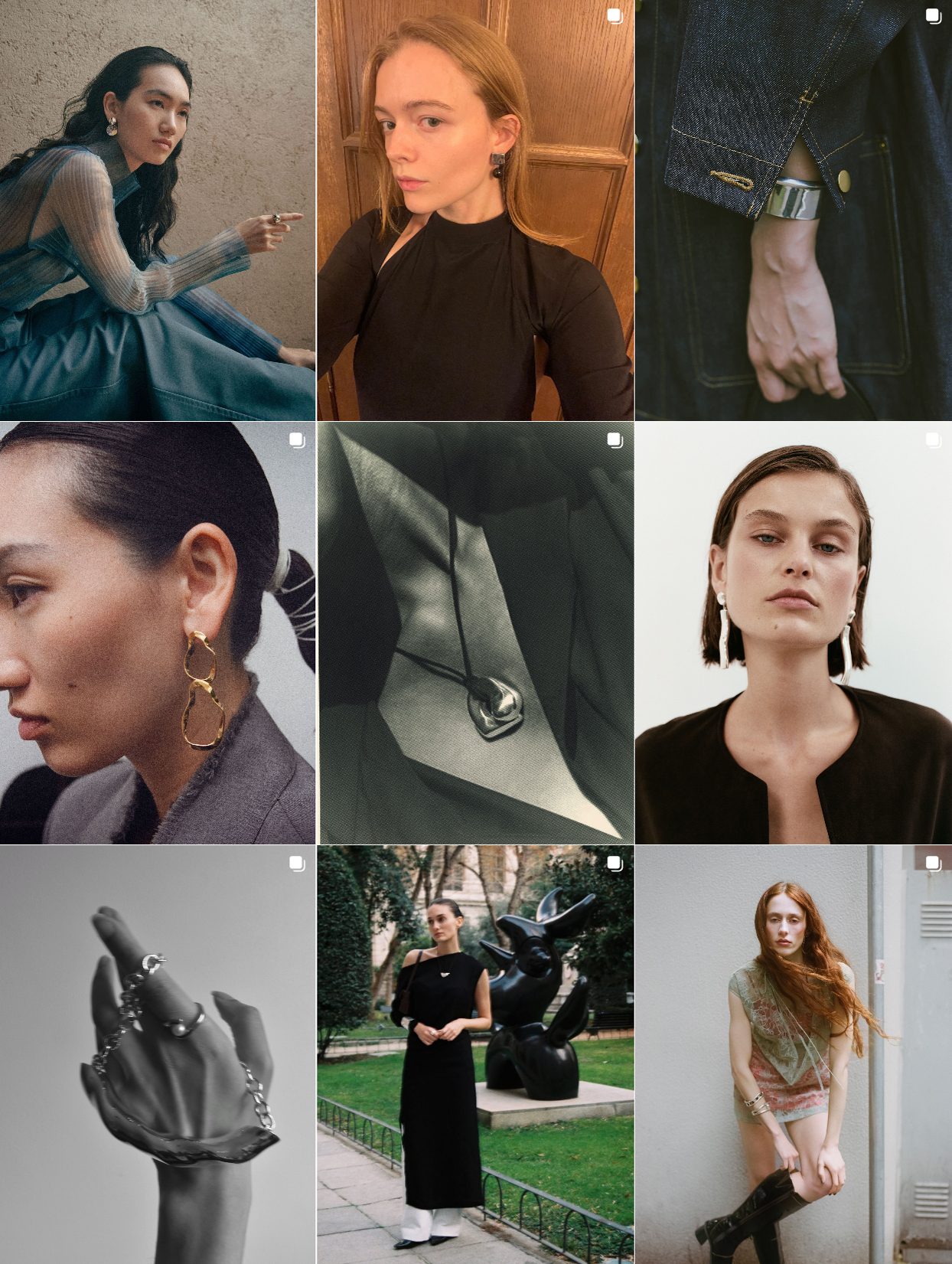
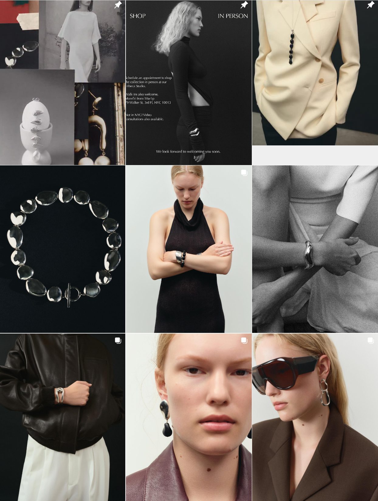
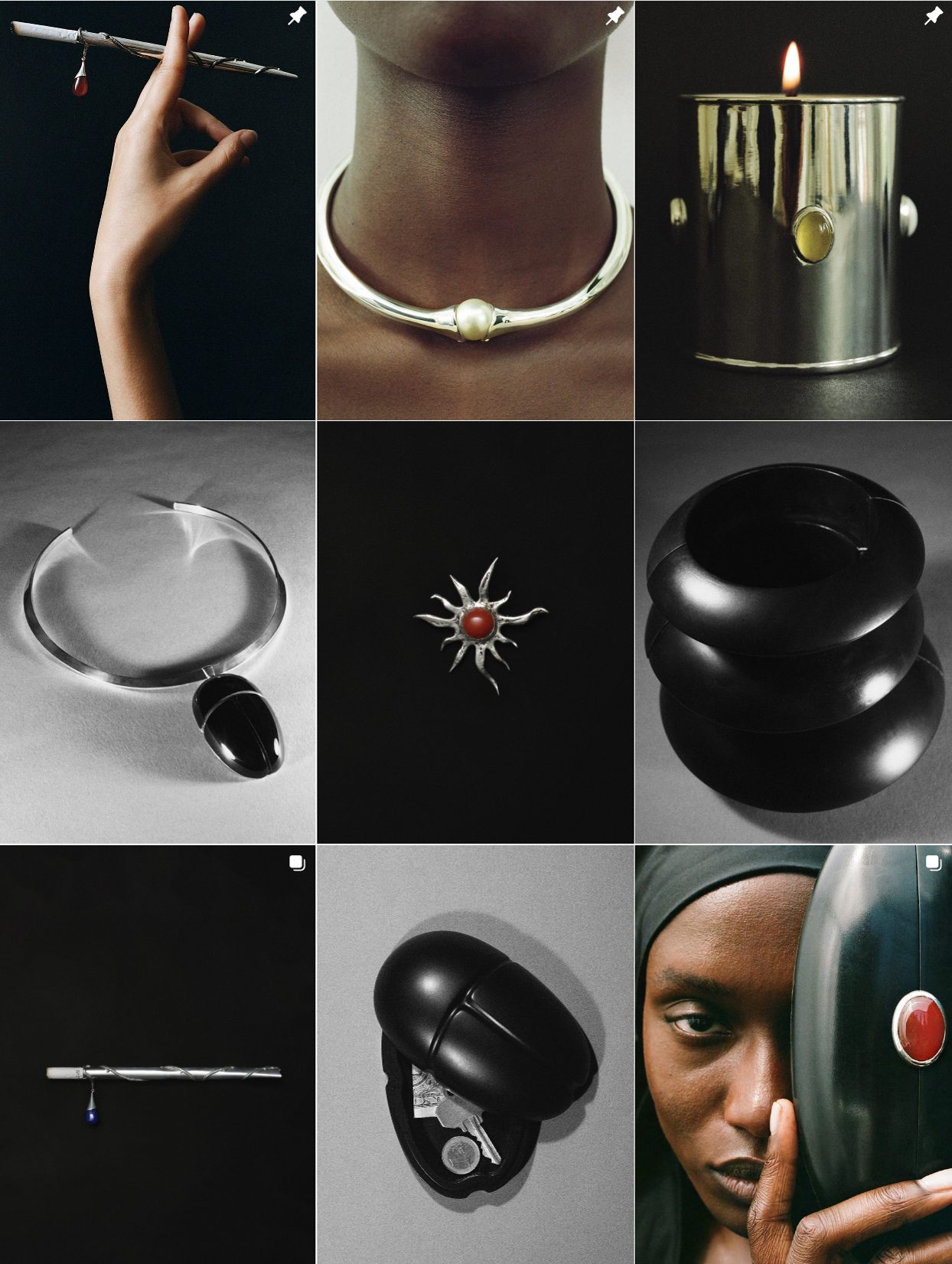
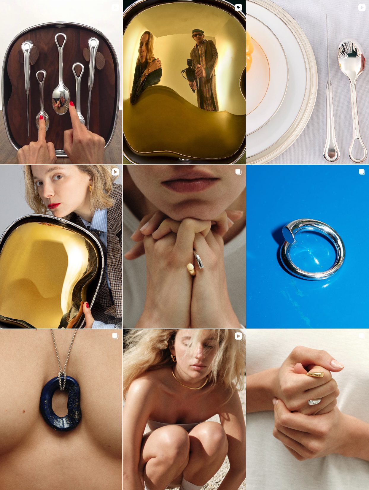
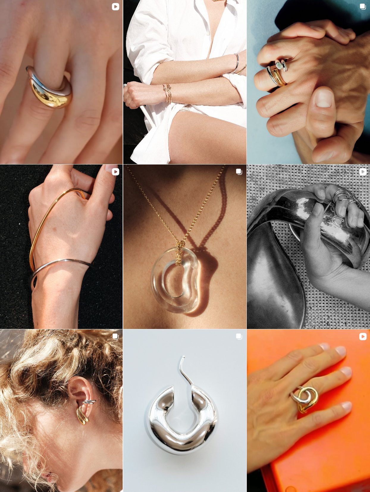
Charlotte Chesnais Sculptural Minimalism Meets Visual Subversion
On Instagram, the brand’s feed reads more like a curated design exhibition than a product showcase. And that’s its power.
You won’t find traditional lifestyle tropes or polished influencer shot here. Instead, there’s a kind of visual subversion: a pearl necklace slung across a sunlit torso, a ring photographed so close you can see the fingerprint smudges on the gold, or a twisted metal earring dangling like a question mark. The hand shots, a staple of every jewelry feed, feel different here. They don’t pose. They clench, flex, grip, as if the jewelry is sculpting them back. How the brand works with recognizable personas deserves awards. Kendall Jenner featured not as a famous face to attract wider traffic, but as a gorgeous woman with a powerful expression and her own story behind her shoulders.
The compositions are sometimes off-center, eerily symmetrical, but always sharp. There’s a rhythm in the visual language that aims to provoke. It’s just never begging for attention. You have to come to it. This is not jewelry made for the Instagram algorithm. It’s made for the kind of consumer who screenshots quietly, saves obsessively, but buys.
Takeaway for Brands:
In a sea of sameness, Charlotte Chesnais uses Instagram not as a sales channel, but as a place to connect with potential buyers. And for a growing niche of design-literate enthusiasts, that’s exactly what keeps them watching.
Charlotte Chesnais Instagram

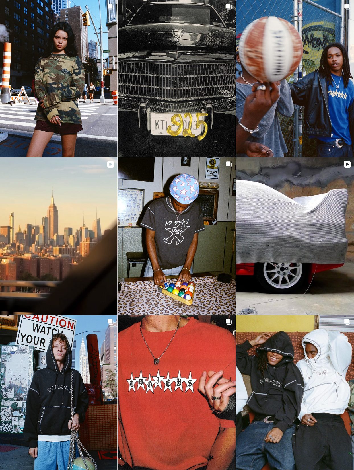
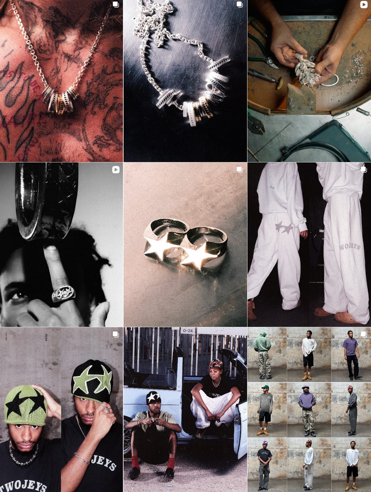
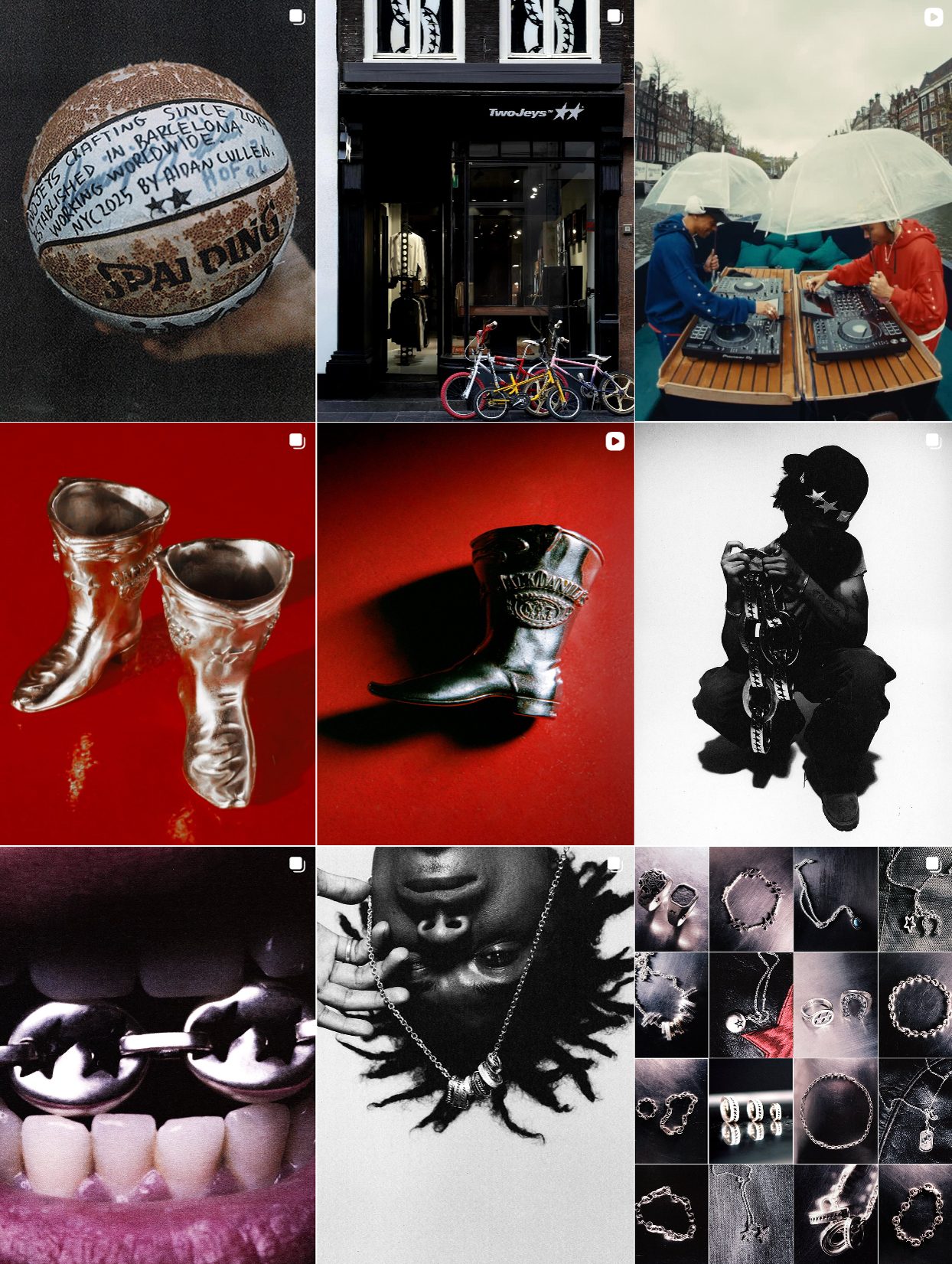
Twojeys Streetwear Silver With Swag
Twojeys is building a visual world that feels like a mixtape of underground nights, streetball courts, and late-night city walks. Their Instagram swaps out polish for grit: flash photos, raw film grain, silver jewelry shot on skaters, rappers, and rebels.
Instead of showing the product in isolation, they embed it into stories, say, a chain glinting in a DJ booth under umbrellas, rings thrown on fingers racking pool balls, pendants peeking out under camo hoodies. Every post feels like a freeze frame from a cult movie.
What sets Twojeys apart is their refusal to play by luxury rules. They don’t try to look expensive. They look lived-in, and that’s the hook. And this is what they call an identity. And that’s exactly why their audience buys in.
Takeaway for Modern Brands:
Twojeys’ brand voice is carved out visually, post by post, through a steady drip of rebellion. There’s a consistent refusal to follow the visual codes of traditional jewelry marketing. Instead of elegance, they show edge. Instead of whispering luxury, they shout attitude.
Twojeys Instagram
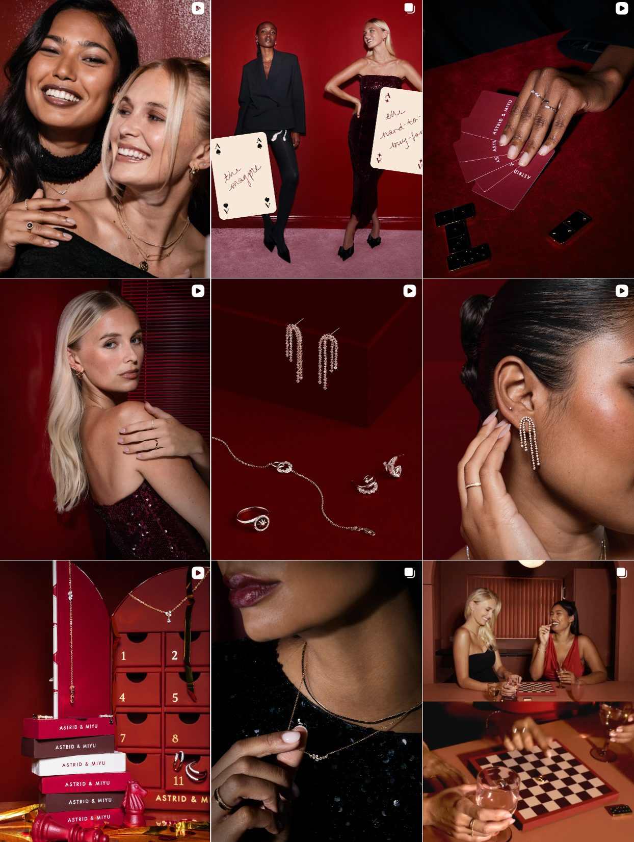
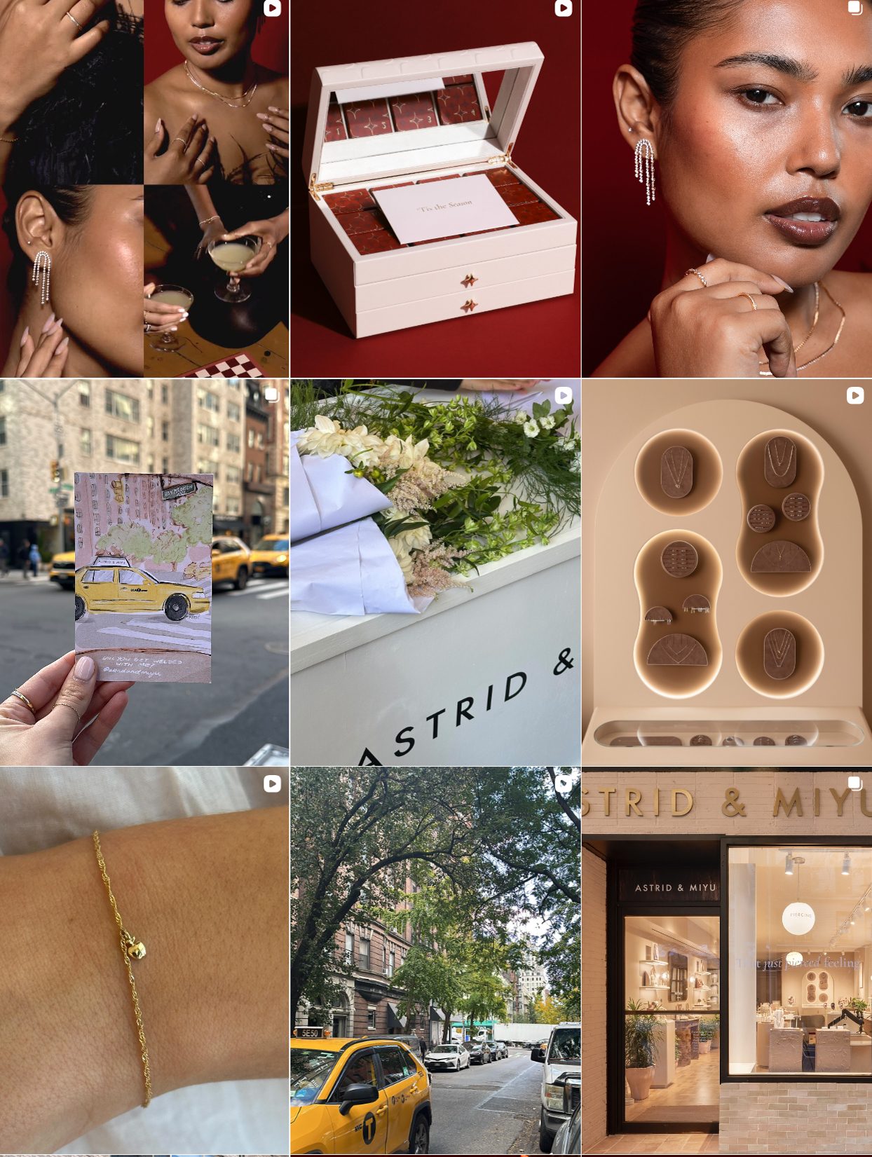
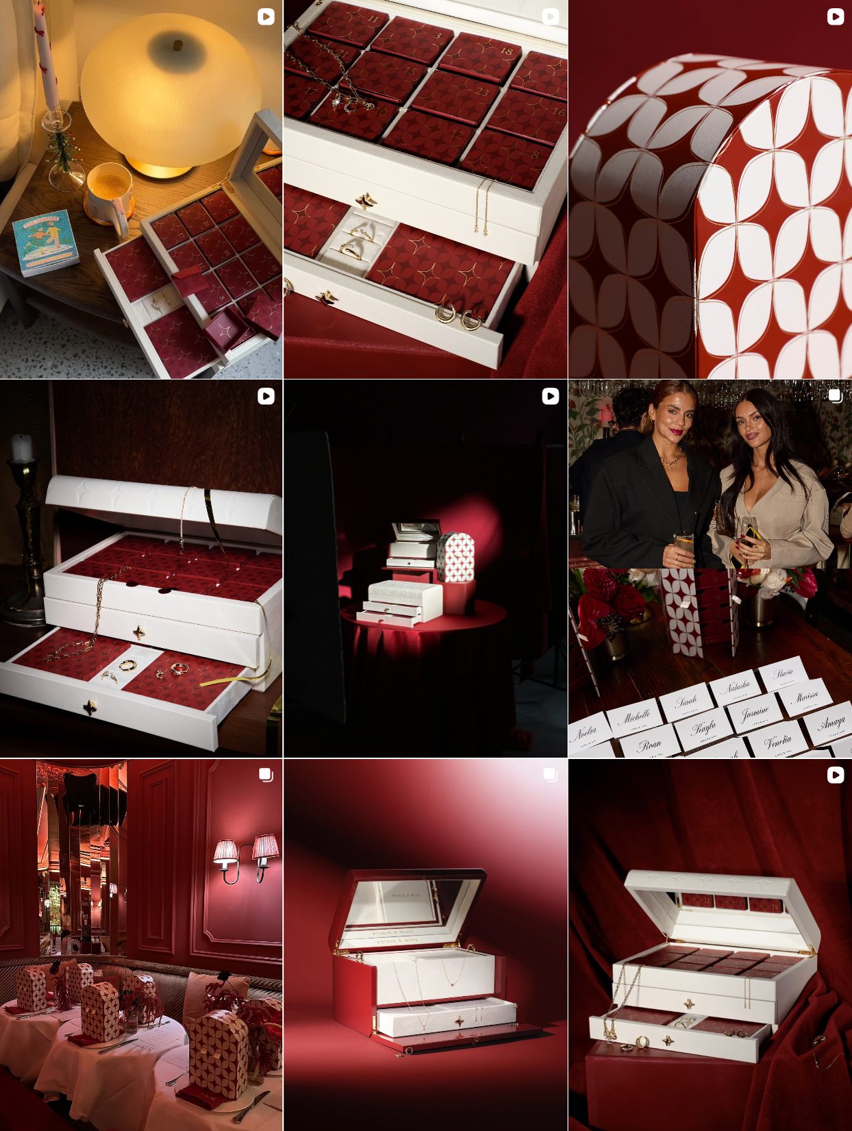
Astrid & Miyu Jewelry and Joy
Astrid & Miyu is way more than just a jewelry brand; it’s a representation of a jewelry mood. Their Instagram reads like a curated diary of nights out, secret messages passed under the table, flirty glances, and group hugs that sparkle. The aesthetic is rich in reds, burgundies, and warm skin tones. Everything feels tactile: velvet, gloss, cheekbones with highlight, and cocktails clinking next to stackable rings. It’s less about luxury and more about intimacy and belonging
There’s a consistent storyline of community: duos, trios, close-up portraits where models look like real-life best friends who just raided a jewelry box together. Product shots appear in red velvet jewelry cases or paired with drinks, games, and whispers. Even campaign cards come with hand-written messages, “she makes her own luck,” reminding you that empowerment is the real accessory here.
Lessons to Learn:
While the styling flirts with glam, it stays accessible: studs you can imagine wearing to brunch, layered necklaces for first dates, and gift sets that feel personal. Astrid & Miyu have mastered the language of meaningful moments, and they use jewelry as punctuation.
Astrid & Miyu Instagram
So, What Makes a Jewelry Brand Hot on Instagram?
It’s not just product or aesthetics alone. The brands that stand out right now understand Instagram as their stage, their journal, their point of view. Some, like Charlotte Chesnais, make jewelry feel like sculpture. Others, like Astrid & Miyu, make you want to text your best friend and plan a night out just to wear those earrings.
Each brand builds its own world, through casting, color, captioning, visual rhythm. And they all make one thing clear: selling jewelry on Instagram isn’t about “posting consistently” or using the right hashtags. It’s about storytelling. Brand identity. Emotional signal. Visual tension.
If you’re a founder, creative director, or marketer reading this and thinking, “how do I make my marketing work this hard?”, you’re asking the right question.
We break down this question (and more) in our Knowledge Hub, where you’ll find deep analytics, playbooks, and creative tactics for growing your jewelry brand online. No fluff, no recycled tips, just the real frameworks behind standout content. Take a scroll through. You might see your brand differently by the time you’re done.